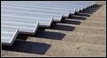
DPChallenge: A Digital Photography Contest You are not logged in. (log in or register
 
Browse Settings
Currently viewing:
Registered Userstephan

Show comments:

Per page:

Order:

Comments:


Comments Made by stephan
Pages:   ... ... [53]
Showing 61 - 70 of ~528
Image Comment
'Water Under the Bridge' (Cello Bridge)
03/23/2003 09:41:17 PM
'Water Under the Bridge' (Cello Bridge)
by dsidwell

Comment:
Greetings from the Critique Club, David :)

Composition: Good. I like the angle you used. There is some wasted space in the upper right corner. It's mostly black and the strings seem to be some kind of visual "barrier" which keep your eyes in the lower left corner, where the light is. There are two brighter spots under the strings in the black area, but I can't really see what they are (it's not the water). That's a bit distracting. Either add more light to the black area or remove these spots. I also would like to see the full shape of this backward "S" formed hole (unfortunately I don't know the correct English term).

Lighting: Like others in the comments said: Gorgeous. I like the mix of light and shadow very much. Good job!

Focus: The focus is good for my taste. The narrow aperture creates a sufficient DOF.

Challenge: In my opinion adding the water was not necessary. But I understand the play of words you wanted to achieve. Anyway, personally I think it's a bit too much "staged" and a more natural approach to the nice forms of the cello would be better.

Creativity: A unique take on the challenge! Good idea!
Wrong way out
03/08/2003 08:19:56 AM
Wrong way out
by arnit

Comment:
Arnit, this is my favourite of this challenge. I was a bit surprised that this photo was yours. But now I have even more respect for you because I see that you not only can make good photos with a "nice" theme but also about a more dark theme. The lighting is so great and focus, too.

Stephan
"Never Get My Way"
03/08/2003 07:58:52 AM
"Never Get My Way"
by smellyfish1002

Comment:
Greeting from the Critique Club, JD :)

Composition: A typical portrait format. Nothing wrong with that. The tiles in the background (and the wet hair of the child of course) make you recognize that the photo was taken while bathing. The viewer can't relate that to the despair theme and it makes the photo look like a private snapshot. So in my opinion the tiles are distracting.

Lighting: In my opinion that's the weakest part about this photo. Normal flashlight almost always sucks. Parts of the childs face are overexposured and there is a nasty shadow behind him (or her?) on the wall. This also makes the photo look too much like a snapshot for the family album. But I understand that this is a candid photo and you can't really take a long time to prepare your lighting. But still, it doesn't look nice to me. Black&White was a good decision though.

Focus: The grain is interesting. I like grain :) But I think to be truly effective you should increase the contrast and decrease brightness.

Challenge: Well, the child itself looks more sad in general than despairing. But the title gives a good hint to understand your intent. I think it fits to the challenge.

Creativity: A creative take on the challenge theme, to portray a childs helplessness to get its way. It sure is different from all the other photos.
Collateral Damage
03/03/2003 06:43:50 AM
Collateral Damage2nd Place
by nds

Comment:
Congratulations to your missing ribbon, my brother! Again you totally outdid me ;)
Photographer found comment helpful.
Implosion
03/03/2003 06:38:34 AM
Implosion
by stephan

Comment:
I was very surprised to see how the score had risen during the week. Never expected such a high score for this kind of photo. So I'm very happy, especially because many said that even they normally don't like this kind of digitally manipulated images, they think it works well for this theme. But beware, this only encourages me to refine my skills in digital work ;)

See the "Photographer's Comments" for a description how I did the effect. It was not done with an infrared filter as some suspected, I don't own one (yet!). The "trick" is the colour inversion.

Thanks to all for your feedback. Very appreciated!
Grandstand Piano Keys
02/27/2003 10:31:13 AM
Grandstand Piano Keys
by DougPaz

Comment:
Greetings from the Critique Club, Douglas :)

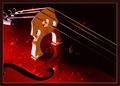
Composition: The diagonal alignment is a nice composition. I loaded your photo to my image editor and I cropped a bit more from the right just so that the end of the rows of seats is in the upper right corner. Personally I think that would improve the photo and makeit more powerful. I think this also would have allowed you to incease the height of the final image. It looks a bit small like it's now.

Lighting: It's a little bit too light for my taste, but that's personal preference. Also a nice twist would have been to decrease the saturation of red and only leave the blue tones of the seats saturated. But people think differently on this kind of modifications.

Focus: Focus is good. Maybe a bot too good, because the photo suffers immensly from the so called moiree effect. I guess you know what I mean. I also struggled with that effect before and I think adding a little blur before downsizing the image helps a bit. Recently there was a discussion about that topic in the DPC forum with more useful tips. Unfortunately I don't find the link now.

Challenge: Yes it fits to the challenge theme. The title suggests a double meaning regarding "rhythm". First the repetitive pattern and second that the pattern looks like piano keys. Well, with some imagination you can see a similarity to piano keys but I think it's not very striking ;)

Creativity: The photo is not particularly unique or inventive but nevertheless you had a good "photography eye" seeing this perspective.


Feel free to email me if you want to discuss the photo more. I also can send you a copy of the image with the modifications I described above (cropping, colours).

Stephan
Almost Gone
02/27/2003 09:00:09 AM
Almost Gone
by JPR

Comment:
This is an outstanding photo!
Photographer found comment helpful.
120 Seconds of Fame
02/25/2003 01:40:37 PM
120 Seconds of Fame
by stephan

Comment:
Thanks to everybody for your feedback. Especially the funny comments :-)

The title is explained in the "photographers comments" above.

I agree with you about the hotspot. It is a bit overexposured. I tried to fix that when taking the photos but couldn't get my lighting correctly. So this photo, which I made very early during this "shooting", was the best I had.

Some people said they didn't like the dark spots on the banana. But that's what I really liked ;-)
Snow Tree at Night
02/23/2003 07:33:55 PM
Snow Tree at Night
by pauld

Comment:
Wow! I like the colouring. Not exactly yellow but it comes close. The dark spot on the lower left side is a bit distracting, but that's only a minor issue. Great photo!
Old Door / Charleston, SC
02/23/2003 07:28:21 PM
Old Door / Charleston, SC
by pstuhr

Comment:
Very beautiful! I love the yellow/green colours. Looks almost a bit "magical".
Photographer found comment helpful.
Pages:   ... ... [53]
Showing 61 - 70 of ~528


Home - Challenges - Community - League - Photos - Cameras - Lenses - Learn - Help - Terms of Use - Privacy - Top ^
DPChallenge, and website content and design, Copyright © 2001-2025 Challenging Technologies, LLC.
All digital photo copyrights belong to the photographers and may not be used without permission.
Current Server Time: 08/12/2025 06:46:54 AM EDT.