| Image |
Comment |
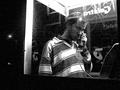
| 06/30/2002 08:02:00 PM |
Scratched.by lisaeComment: Good photo! Black white works very good. I like the grained look. Somehow looks like a still from a film. I'm sure many people suggested to zoom in a little bit but I'm not sure if such a tight crop would be better. Instead I would have tried to show the face more clearly. E.g. by going a step to the left so that the scratch is not in the middle of his face. The person is more interesting than the scratch. Photo 9, Creativity 10, City Life 8 = 9 |
| 06/30/2002 09:25:00 PM |
|
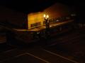
| 06/27/2002 10:20:00 PM |
Home Sweet Homeby liltoolComment: nice shot. interesting interpretation of "city life". a bit overexposured because some of the paper is totally white. photo 8, creativity 8, city life 8 = 8 |
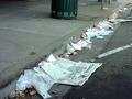
| 06/27/2002 08:26:00 PM |
Monday ...............on 3rd St.by rajronComment: Has a nice mood. I like the silence and calmness the photo transports because of the light and the long shadows (dawn or sunset ?) I would have zoomed in a litte bit. The post on the right side frames the photo wich is nice at first but when I take a sheet of paper and cover it on my screen it looks better somehow. Also the shadow of yourself taking the photo is a bit distracting because it's an "unnatural" dark spot in the middle of the light. Maybe when the car in the center would not have been there the photo would be even more "calm". Also the yellow sign makes a bit more busy but not so much because the color matches to the whole photo. Photo 7, Creativity 4, City Life 8 = 6 |
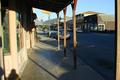
| 06/27/2002 08:57:00 PM |
Let's go to the moviesby CreativeFlyPhotoComment: very nice! good light and quite interesting to look at. the curbstone of the street distracts so a little up would be better. this also would have shown more of the nice blue neon light. i like the twisted angle because it makes the one tower stand upright and the other titled which makes the photo exciting. photo 9, creativity 8, city life 9 = 9 |
 Photographer found comment helpful. Photographer found comment helpful. |
| 06/27/2002 09:18:00 PM |
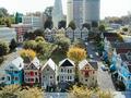
All in the family. Out of LEGOS!by MagsCoyoteComment: is that really all made of lego bricks? maybe portrait format would have worked better, because then the skyscrapers could be seen fully, which would stress the contrast between the victorian houses and the mordern skyscrapers more. or leave it landscape and zoom in to the houses in the front row. then maybe it would have been more visible that it's made of lego. overall more city than life but that's ok. photo 7, creativity 8, city life 7 = 7 |
| 06/19/2002 09:04:00 AM |
|
| 06/19/2002 09:15:00 AM |
We Three Treesby elemessComment: the three trees as the focused objects don't have enough contrast to the forest in the back. what is that dark line on the top? |
| Photographer found comment helpful. |
| 06/19/2002 08:29:00 AM |
|
| 06/19/2002 09:03:00 AM |
Dining at Duskby jbolingComment: somehow a bit "uneasy". maybe because there are three objects in focus plus the strong light in the middle. all distributed over the whole picture. addittionally a lot of lines cut the picture. the folds of the cloth and the edge of the shadow from left to right. |
Home -
Challenges -
Community -
League -
Photos -
Cameras -
Lenses -
Learn -
Help -
Terms of Use -
Privacy -
Top ^
DPChallenge, and website content and design, Copyright © 2001-2025 Challenging Technologies, LLC.
All digital photo copyrights belong to the photographers and may not be used without permission.
Current Server Time: 08/12/2025 07:13:45 AM EDT.