| Image |
Comment |
| 08/04/2002 11:56:00 PM |
cornershopby grahamgormanComment: Finally a photo where the photo tells the story not the title! Very good creativity. The big malls kill the small cornershops. To me it's not an spectacular technically interesting photograph (apart from the grey tones which support the theme well), but it has a clear message. That's why I like it. |
| 08/04/2002 11:46:00 PM |
Watching Over Capitalismby magus1Comment: Very nice photograph. Good angle. There are two points of interest. First the flag, because imaginary guiding lines point to it (e.g. the skyscrapers on the left and especially on the right). Second, the statue with the interesting gesture. Some could say that's not simple enough and you should have concentrated on one object, but I like it. With some phantasy one can interpret the flag as a symbol for capitalism. The sun flare is a little distracting but actually I think the writing behind the statue is more distracting. It would be so nice without it, but I guess they would have thrown you in jail when you would have tried to remove it ;-) I guess the writing was colored, so you decided to make the photo black and white. That was a good decision. |
| 08/04/2002 09:26:00 PM |
|
| 08/04/2002 09:23:00 PM |
|
| 07/29/2002 01:48:00 PM |
Rock, Paper, Scissorsby stephanComment: I was pretty shocked when seeing the first two comments. I wasn't aware of the photo in the Games challenge. However, I think I would have submitted anyways when knowing in advance. The glare on the scissors was intended. I wanted to show the cool, gleaming metal in contrast to the plain paper and the fractured rock. Actually the glare was what made me to submit this photo. Thanks to all for your comments. |
| 07/28/2002 10:39:00 PM |
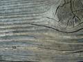
Old Barn Woodby kposeyComment: it's quite unsharp. try to decrease the aperture to have more DOF. |
| 07/21/2002 07:07:00 PM |
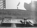
Flying...by lennierComment: Very creative! Interesting angle. But i think it would be better if you had cropped more from the top so that it's not visible that the figure is connected to something. Even if that involves cropping the fingers. |
| 07/22/2002 07:24:00 AM |
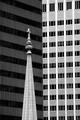
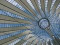
Sony Center Cupolaby stephanComment: Wooho! It's my highest scored photo now :-) Many thanks. I was a bit worried about being "cliche" because it's an often photographed subject in Berlin, but since most of you live in the US I thought I would be on the safe side ;-) It's a bit strange to see that most of you voted with 6 but I almost only got very positive comments. So special thanks to pnicholls for the constructive criticism. I also would have liked a little more of the shades on the right side. Now it looks a bit open. But I wanted the shaft going straight to the bottom right corner more than showing more on the right side. A different angle was not possible because of the surroundings. There were inhibition gates around because cunstruction men wanted to build a stage or something. The security guards didn't let me through. Anyway. Thanks again for all your positive feedback. Much appreciated :-) |
| 07/21/2002 06:57:00 PM |
Lonely by GoatfatherComment: Very nice. Simple, yet powerful. I think using the rule of thirds and zooming out and putting the flower to the lower right corner would make this shot even better. |
| 07/21/2002 06:37:00 PM |
Falling into a Dream by timj351Comment: Wonderful photo! Very nice lighting and colors. The only thing is that I would have tried to let the girl look up, maybe a little more to the direction of the watrerfall. Now she seems to be a bit concentrated too much on herself. The title suggests that she's falling asleep but then I would have chosen a more relaxed pose. Like resting on her ellbows. |
Home -
Challenges -
Community -
League -
Photos -
Cameras -
Lenses -
Learn -
Help -
Terms of Use -
Privacy -
Top ^
DPChallenge, and website content and design, Copyright © 2001-2025 Challenging Technologies, LLC.
All digital photo copyrights belong to the photographers and may not be used without permission.
Current Server Time: 08/13/2025 02:39:28 PM EDT.