| Image |
Comment |
| 08/05/2002 10:10:00 AM |
Warm Patina of My Aged Wooden Bowlby GraciousComment: Nice idea, but when you want to show the bowl why did you add the lemon, the knife and the salad on top of it? It's a bit too much for my taste. Especially the bright yellow lemon. Also this photo if very blurred and looks like it has a bad jpeg compression. Colors and lighting are nice and it could have been a good photo. |
| 08/10/2002 11:35:00 PM |
Everlasting Beautyby BaldurComment: I like how the statue is hidden in the bushes. Maybe an inteded underexposure would have created more contrast between the statue and the surrounding. Different light (sunset!) also can make a photo much more interesting and dramatic. -stephan |
 Photographer found comment helpful. Photographer found comment helpful. |
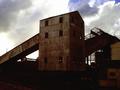
| 08/10/2002 10:42:00 PM |
Old Power Stationby lisaeComment: Nice photo! I like the lighting. With the bright background the building is almost only a silhouette. It has enough light to show the rusty surface but not too much so that too much unimportant details in the bottom area are revealed. Maybe off-centering the subject and moving the camera to the left would have made it even more effective. -stephan |
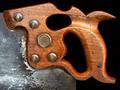
| 08/10/2002 10:58:00 PM |
Centenarianby autoolComment: Very nice. This saw certainly looks old and used. Good composition, interesting textures and curves. -stephan |
| 08/08/2002 09:15:00 PM |
Baglama's True Dreamby conqComment: Interesting angle! Unfortunately the white spot distracts too much. Use indirect light to avoid this. The DOF is too small for my taste. The strings behind this "thing" in the middle are in focus. But what is there? Nothing interesting. If you subject of interest was the instrument then you should have brought more if not all into focus. - stephan |
| 08/09/2002 05:44:00 PM |
Something Oldby sulamkComment: I'm not sure if the light from below at the medals was a good choice. For itself it looks good, nice contrast and very dramatic, but I think it does not fit to the photo in the background. It almost looks like the medals were put into the photo in postprocessing (what I don't think was actually done). But there is such a high contrast between the two subjects that it looks strange. Also in regard to the colors. The medals are highly saturated but the photo has very soft colors which really look old. Now it could be that this contrast was intended. If so then, well, I don't like it ;-) It also would be nice to see the medals completely. Instead I see the dark cloth or something like that. I also don't like that the right edge of the photo is visible. Anyway, it fits the challenge and it's a good idea. -stephan |
| Photographer found comment helpful. |
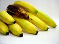
| 08/10/2002 07:28:00 PM |
El plátano en el bolsillo del diabloby karen_vComment: Nice idea! Unfortunately I don't understand spanish but I think I get the photo without the title, too :-) I like the lighting and the colors. Only thing I would like better is if I could see the bananas fully and not cut at the left side. Zoom a little out. -stephan |
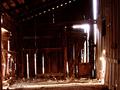
| 08/08/2002 09:22:00 PM |
untitledby aelithComment: Beautiful photo! I like this a lot. Only thing I could nit-pick about is that the bright light in the upper right corner does not fit to the rest of the photo. It's a touch too bright and also has a blue tint. If it would be the same like the bright light in the lower right corner (on the right wall of the barn) then it would be perfect. Unfortunately I don't have a suggestion how this could be achived. -Stephan |
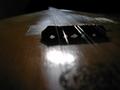
| 08/08/2002 09:06:00 PM |
Violinby cq107Comment: I like this photo very much, especially the colors. Good focus, DOF and composition, too. Only the lighting is a little strange. The areas in the middle under the strings are too white and the gleam in the top right corner is a little too hot in contrast to the rest of the photo. But still a beatiful photo! - stephan |
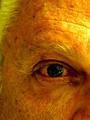
| 08/10/2002 11:07:00 PM |
RusticMeby focusComment: I'm not sure if the lighting and the coloring fits the subject. I think it would have been more effective if you would have used light from the side. That way the skin would have more shadows and more contrast and the wrinkles were more visible. This would increase the old look. Also black & white would be better in my opinion. I also would like to see more of the person. A portrait would be nicer. Anyway. Despite of all that. overall I still think it's a nice photo. -stephan |
Home -
Challenges -
Community -
League -
Photos -
Cameras -
Lenses -
Learn -
Help -
Terms of Use -
Privacy -
Top ^
DPChallenge, and website content and design, Copyright © 2001-2025 Challenging Technologies, LLC.
All digital photo copyrights belong to the photographers and may not be used without permission.
Current Server Time: 08/13/2025 11:41:13 PM EDT.