| Image |
Comment |
| 08/17/2002 09:13:00 AM |
New Sidewalk Artby wargloryComment: Nice subject. I think this photo would be better with a wider aperture so that the background is more blurred and thus less distracting from the subject. |
| 08/12/2002 09:00:00 PM |
2nd/3rd century ADby stephanComment: I find the diversity of opinions very interesting... If I count how many people like the lighting (counting me in) and how many think it's too dark it's 9 to 9. I'm not sure what to do now ;-) After reading floyds comment I also see that the photo would have looked better when the light was more evenly distributed. The direction of the light was not under my control as the statue is in a museum and I think they wouldn't be very happy if I would have started to adjust the lamps ;-) Personally I liked the photo for the strong shadows and to me it looked almost like the statue "beholds" me. That was also the reason why I cropped it that way. To me the statue looks down at me and somehow I liked this effect. Anyway, many thanks for your comments. As always, most welcome :-) |
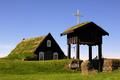
| 08/09/2002 05:01:00 PM |
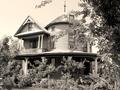
Beyond Repairby FranziskaLangComment: I can't really say why, but I like this photo very much. Nice composition. The photo has an appealing simplicity. To me the house looks old and abandoned. So you met the challenge very good. The way how to roof in the background goes straight up and has these lines pointing to the subject is nice. I also like the broken window halfly hidden behind the tree. Maybe a touch overexposured because the area to the left of of the window is a little blown out, but I see that it was a difficult scene. High contrast between the white wall and the shadows created by the trees on the right side. -stephan |
 Photographer found comment helpful. Photographer found comment helpful. |
| 08/10/2002 11:21:00 PM |
Fond Memoriesby SonifoComment: I like the lighting. The photo really looks like from a photo album of my grandma ;-) Composition good. I like how the tree(? or bush?) on the right side frames the photo. -stephan |
| Photographer found comment helpful. |
| 08/10/2002 11:27:00 PM |
The Originalby CreativeFlyPhotoComment: Very good photo! Nice subject, I don't even own a player for these "big black compact disks" ;-) Excellent DOF. The grain is ok, it makes the photo look even older. Also very nice how the lighting reflects in the furrows. One of my favourite photos this week. -stephan |
| Photographer found comment helpful. |
| 08/10/2002 11:18:00 PM |
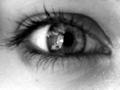
wise eyesby subtleComment: In the thumbnail view I thought "Wow! Beautiful photo!". But now in close up I think it's just a little bit too blurry (but still a beautiful eye). I like the blur for how it softens the eyelashes, I just think it's a tiny bit too much. I must admit I don't really understand the theme and title. The eye looks so young and not really belonging to a wise old guru or something ;-) -stephan |
| 08/09/2002 05:10:00 PM |
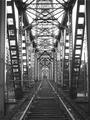
Never Againby Ricky CleaveComment: Very artistic photo! Really nice how the rails disappear in the perspective. Good composition. The closed gate shows that this is an old track and not used anymore. The title stresses that further. The lighting looks like it's a rainy day in november. This fits nicely to the theme. It looks a little flat and I wonder how it would look with more contrast between near and far, so that it has more depth. Anyway, this is just an idea and I like it how it is, too. -stephan |
| 08/05/2002 09:39:00 AM |
1896by arnitComment: Nice photo. I would have converted it to black and white. Then the photo would actually look old. The very saturated colors are somehow a contradiction here. |
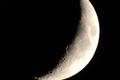
| 08/05/2002 09:47:00 AM |
Waning Crescentby MorganComment: I like the subject. I had this idea, too ;-) A little more sharpening would have been better. The composition also could be better for my taste. Either zoom even more in or zoom a little out so that the edges aren't cut. |
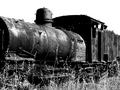
| 08/09/2002 05:21:00 PM |
Not going Anywhere!by PointComment: This is one of my favourites this week! A good subject and I like the strong contrast. Good composition. I like the grass in the foreground because it makes visible that the train is abandoned and on a probably long forgotten track. Clever title, too. |
Home -
Challenges -
Community -
League -
Photos -
Cameras -
Lenses -
Learn -
Help -
Terms of Use -
Privacy -
Top ^
DPChallenge, and website content and design, Copyright © 2001-2025 Challenging Technologies, LLC.
All digital photo copyrights belong to the photographers and may not be used without permission.
Current Server Time: 08/14/2025 07:18:29 AM EDT.