| Image |
Comment |
| 10/13/2002 07:05:00 PM |
Pizza Hutby sanandanComment: Wow! This seems to be the perfect photo to me. It has a very photo-journalistc feel and is very touching. I really would like to know more about the circumstances of this photo. Great work! -stephan |
 Photographer found comment helpful. Photographer found comment helpful. |
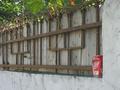
| 10/13/2002 08:35:00 AM |
An Empty Canby mookyfishComment: Maybe you should have taken this photo from the other side. I learned that when viewing a photo the eyes follow along the lines (if there are any). In your case the eyes want to wander to the left because of the perspective lines in the fence. When shooting from the other direction these lines would converge in direction to the can and thus attracting to eyes to your subject. Just an idea. -stephan |
| 10/06/2002 04:45:00 PM |
Reflecting on Bathtime Memoriesby SonifoComment: For a couple of seconds I belived that there's really a baby reflection in a mirror or something. Now I see that it's a photo. Nice idea! -stephan |
| Photographer found comment helpful. |
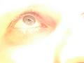
| 10/07/2002 08:29:00 PM |
Visionsby stephanComment: Well... of course it was not an illegal filter (will this never stop ;-)) and the overexposure was intentional of course, too. I even made it brighter in postprocessing :-) Maybe I make another version where I leave the brightness just as it is. I'm not sure if this is a monitor calibration thing again, because when I looked at the photo on a TFT display with not so much contrast it was really ugly. And yes, this is a self portrait. That was the really tricky part. Try it and you'll see that photographing your own eye is not easy. At least it wasn't for me. The light is afternoon sunlight btw. I understand that some poeple think it's a bit weak at meeting the challenge because the reflection is not the "main thing" of the photo. I almost guessed that in advance but I submitted it anyway. I like the lighting and the overall look of it very much. To me it has a lot of emotion. The comments were mostly very pleasing and I enjoyed them a lot. I think I'll just ignore the score ;-) |
| 10/05/2002 12:21:00 PM |
glowby shutterflyComment: Moody picture. I like the backlighting. I would have tried to show more of the nice sky and less of the black water. -stephan |
| 10/07/2002 08:56:00 AM |
Washed ashoreby RemieComment: Remie, I liked your photo a lot and gave it an 8. I love the overexposure and the green bottle is a nice colourful spot which makes the photo interesting. I also like the grain because it adds to the more "unrealistic" look of the photo, almost like a painting like you said. The other photos of the same style I found on your website (//home.wanadoo.nl/~rwam/portfolio.html) are also very good, especially the one called "Linear reflection". Simple but effective. I guess you had a hard time choosing your submission out of these. ;-) |
| 09/29/2002 10:17:00 PM |
This is a corner of my flat. I marked it red because I want to die.by anwlComment: Nice photo! I like it a lot for its creative title. A bit too blurred which makes it hard to recognise as a corner of your flat. I'm really curious to know if that's really a corner of your flat or just some scribbled lines on paper. I hope you're still alive next week to tell us... |
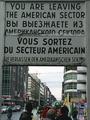
| 09/30/2002 09:33:00 AM |
Reunificationby stephanComment: Well... just four comments... seems the photo really sucked. I agree that it's not a great shot, it was more the theme I tried to convey. See the photo details for an explanation. But even that didn't came across. I thought that most people will recognise the sign and associate it with the history it stands for. Well... apparently not. I chose this photo of the series _because_ it was busy. I wanted to show the contrast of all the trouble in the history (represented by the sign) and the normality today (represented by the street scene). In all the other photos I took at this location there were tourists staring at the sign and photographing like me ;-) I liked how the people walk normally over the street now when some years ago there was the Berlin wall with fences, army guards etc at this place. I also didn't want to remove the cranes because they somehow added to this picture (in my opinion). They show todays progress and development at the former broder areas. Anyway 5.2 is actually a good score for this photo, I just would have liked more comments to see how other people think about it and if it was possible to see the things I had in mind when taking the photo. |
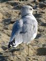
| 09/29/2002 08:52:00 PM |
Jersey Shoreby MaYzComment: Technically a good photo. Especially the nice lighting. However, I don't think you conveyed the challenge very good. You portrayed a bird and not the Jersey shore as suggested by the title. -stephan |
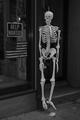
| 09/29/2002 08:20:00 PM |
Only in New Yorkby dimitriiComment: It's not an artistically great photo but a very funny one :-) I think it was a good decision to use B&W. The colours of the flag and the background would have distracted from the skeleton. Now in B&W the white skeleton sticks out from the darker sourroundings. -stephan |
Home -
Challenges -
Community -
League -
Photos -
Cameras -
Lenses -
Learn -
Help -
Terms of Use -
Privacy -
Top ^
DPChallenge, and website content and design, Copyright © 2001-2025 Challenging Technologies, LLC.
All digital photo copyrights belong to the photographers and may not be used without permission.
Current Server Time: 08/14/2025 02:27:25 PM EDT.