| Image |
Comment |
| 11/17/2002 07:55:00 PM |
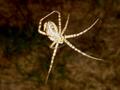
Banded Argiopeby bmacComment: Cool! The spider looks like a ghostly spider made of light. Interesting photo. -stephan |
| 11/17/2002 08:05:00 PM |
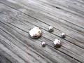
Beautiful Poison (mercury)by mrsingh816Comment: Looks great. But you know that inhaling the gas from mercury is veryy undhealthy? Anyway. A good photo. I like the textures and their contrast to each other (rough natural wood vs. slick glossy liquid mercury). -stephan |
| 11/13/2002 10:00:00 PM |
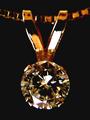
Quarter Caratby rcrawfordComment: Interesting object for a macro, but it seems to be not quite in focus. Maybe a smaller aperture would have helped because that broadens your DOF. This would also have had a nice side effect. In very small apertures (at least f/8) light sources sometimes become star shaped. That would have fit perfectly to this photo because that would convey the brilliance of the diamond better. -stephan |
 Photographer found comment helpful. Photographer found comment helpful. |
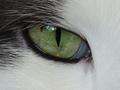
| 11/17/2002 07:20:00 PM |
|
| Photographer found comment helpful. |
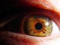
| 11/17/2002 07:57:00 PM |
Iby daysezComment: Great texture in your eye. Creative title ;-) -stephan |
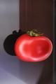
| 11/17/2002 06:54:00 PM |
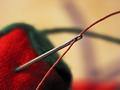
Redby JeanComment: It's a nice idea to let it looks like the tomatoe is hovering in the air, but the background is way to distracting. Lighting is ok. Focus could be better. I can also see the thread ;-) -stephan |
| 11/13/2002 10:09:00 PM |
Summers Endby GolferDDSComment: Sad to see the summer end :-/ Creative concept, but the lighting looks very flat. Did you use a flash? -stephan |
| 11/17/2002 06:55:00 PM |
Floppy Abstractby DCThiessenComment: It's a nice abstract, the colours fit well, but I don't like the grain. Not that I dislike grain always, but in this case I think it doesn't look good. -stephan |
| 11/17/2002 07:37:00 PM |
|
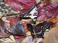
| 11/17/2002 07:35:00 PM |
Featherby lamedosComment: Excellent lighting! It shows the texture very well. Good job! -stephan |
Home -
Challenges -
Community -
League -
Photos -
Cameras -
Lenses -
Learn -
Help -
Terms of Use -
Privacy -
Top ^
DPChallenge, and website content and design, Copyright © 2001-2025 Challenging Technologies, LLC.
All digital photo copyrights belong to the photographers and may not be used without permission.
Current Server Time: 08/14/2025 08:50:38 AM EDT.