| Image |
Comment |
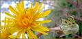
| 05/15/2004 02:36:54 PM |
Living and dyingby trainComment: Nice work. Your background works very well to divide the image into two parts: one part frames the living flower (left) and the other frames the dying flower (right). I think all of your visual cues are working together here - and everything, including your title, captures the "opposite" concept. |
 Photographer found comment helpful. Photographer found comment helpful. |
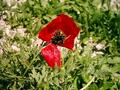
| 05/15/2004 02:32:18 PM |
Red Shaghayeghby balvardiComment: Red and green are contrasting hues, but I don't think the difference between figure and ground is sufficient enough to capture the "opposite" concept. |
| 05/15/2004 02:25:24 PM |
Heads or Tailsby dsa157Comment: Good use of space - foreground/background, head/tail are working together. Had the "head" penny been completely in focus (and the tail not), then I would have rated this higher. Heads and tails are truly opposites. |
| Photographer found comment helpful. |
| 05/15/2004 02:20:58 PM |
|
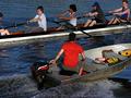
| 05/15/2004 02:14:41 PM |
HORSEPOWER?by Rando D300Comment: Great detail - especially in the wake of the powered rowboat. Image seems a bit dark as a whole. Perhaps "manpower vs. horsepower" may have been a better title. |
| Photographer found comment helpful. |
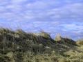
| 05/15/2004 02:10:42 PM |
Heaven and earthby mariaksteinssonComment: Your title and objects both work to support the "opposite" concept. I like the diagonal horizon. The blues look unnatural, however, in both the sky and grasses. Also, I think that if the day had been a clear day (few or no clouds), then the apparent differences in "noise" and texture would have provided even more evidence of the "opposite" concept. |
| Photographer found comment helpful. |
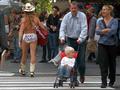
| 05/15/2004 02:02:14 PM |
Normal People; Insane Peopleby alanfreedComment: Which person is the insane person? The Naked Cowboy or the dolt pushing his child into a NYC traffic lane before he enters it himself? I don't think this image captures the "opposite" concept. |
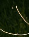
| 05/15/2004 01:57:05 PM |
Hunter and Huntedby mrphrtqComment: I like the layout - but the branches command too much of the figure (via focus and brightness) and so they are pushing your spider and fly into the background. Conversly - I think you've done a really good job of not letting the geometric pattern of the web (via focus?) overwhelm the image. |
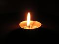
| 05/15/2004 01:50:58 PM |
"In the absence of light, darkness prevails."by MiNyEeComment: Light and dark certainly capture "opposite." Perhaps if the candle was off-center, so that the light would be on a side opposite of darkness (rather than surrounded by it) then every element of the image would be working together. Nice work. |
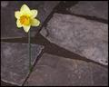
| 05/15/2004 01:47:43 PM |
Hard and Softby ColeyComment: Nice figure and ground. Off-center framing works too. I'm not sure a flower/stem conveys "soft" as well as the pavers/stones convey "hard." |
Home -
Challenges -
Community -
League -
Photos -
Cameras -
Lenses -
Learn -
Help -
Terms of Use -
Privacy -
Top ^
DPChallenge, and website content and design, Copyright © 2001-2025 Challenging Technologies, LLC.
All digital photo copyrights belong to the photographers and may not be used without permission.
Current Server Time: 08/03/2025 11:54:56 PM EDT.