| Image |
Comment |
| 07/26/2002 03:02:00 PM |
Damn Skippyby spidermanComment: LOVE IT!!!! gave it a 9! Perhaps just a tad too sharp/contrast - I love the idea, creative! - the light and shadow are great - as well as the cropping-very effective. Great work. Ruthann |
| 07/25/2002 06:12:00 PM |
Concrete and Textured Titaniumby daysezComment: Interesting photo. I like the different shapes and textures and the contrast and lighting. Interesting shimmering contrasted with a sort of dull archway (top left, not sure what it is) The lines are great too. Great work! Ruthann |
| 07/26/2002 05:55:00 PM |
seedlessby TerryGeeComment: Really terrific work! 10 from me. This is a 'hang-up' photo. Pretty much like everything about it. Ruthann |
| 07/28/2002 12:50:00 AM |
|
| 07/26/2002 03:00:00 PM |
Chains R Usby arnitComment: I love this photo, I give it a 10. Only thing is the title-this photo warrants something a little more for a title. This photo is intriguing. Great job!! Ruthann |
| 07/27/2002 03:31:00 PM |
|
| 07/28/2002 01:24:00 AM |
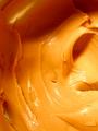
Ridgesby millerComment: This is very interesting. I like the DOF, works well here as does the golden colors. Although it may be intentional, I think it is a little too much contrastry/sharp. Perhaps it was done to emphasize the 'texture', but I don't think it needed it. Still great photo!! 8 Ruthann |
 Photographer found comment helpful. Photographer found comment helpful. |
| 07/27/2002 03:39:00 PM |
|
| 07/25/2002 06:30:00 PM |
Shedding Unicornby eddyComment: Good focus, but overall not that appealing (no pun intended) - to me. I think it may need more contrast - seems a little dull. Ruthann |
| 07/28/2002 12:53:00 AM |
curves, lines and contrastby olyaComment: Very nice photography. The feather gives it a little something extra. I like that it is not completely centered. Good lighting too. 9 Ruthann |
Home -
Challenges -
Community -
League -
Photos -
Cameras -
Lenses -
Learn -
Help -
Terms of Use -
Privacy -
Top ^
DPChallenge, and website content and design, Copyright © 2001-2025 Challenging Technologies, LLC.
All digital photo copyrights belong to the photographers and may not be used without permission.
Current Server Time: 08/21/2025 03:12:44 PM EDT.