| Image |
Comment |
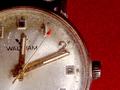
| 08/09/2002 04:55:00 PM |
Time of Death: 12:11by rdesaiComment: Excellent photo. The title gives the photo a hint of mystery - thought provoking. The quality is great. Effective cropping and composition. Excellent work!! 9 Ruthann |
| 08/06/2002 10:53:00 PM |
Atom 153by boyte1Comment: This is a nice photo. the composition and angle are good - as well as the cropping. I can't decide if I like the visible backdrop (the back looks black and the bottom looks navy blue) - but then again, it looks good. I think some of us get so picky...so what if its a little diff, it's still a great shot. originally at 7, but now at 8 Great work. Ruthann |
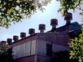
| 08/07/2002 02:23:00 PM |
Remnantby KarenBComment: Great Photo! 2 things I like the best - 1 the way the chimneys make a great diagonal line - great angle 2-The way the light shines through the leaves - very translucent. Excellent photo quality! None of those absolutely frustrating purple fringes/abberations - that alone scores well with me. Great work 9 Ruthann |
 Photographer found comment helpful. Photographer found comment helpful. |
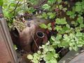
| 08/05/2002 07:49:00 PM |
Broken childhood memoriesby prodigal havocComment: Although I don't care for the title (i think the photo stands on it's own - perhaps a one-word title would be better), the photo is great. I like the angle and the lighting. Nice catch of the rain. I particularly like the how the textures are apparent - the slickness from the rain and the rust in the metal. Good work!! 9 Ruthann |
| 08/09/2002 05:02:00 PM |
Centenarianby autoolComment: Great quality photo. The image is very clear. Black background came out great - good lighting skills. I like the different textures. Seems that it has been around for some time. Good cropping and composition. 9 Ruthann |
| 08/10/2002 05:24:00 PM |
'32 Fordby SwashbucklerComment: Great photo. I like the cropping/composition. Clear and well focused. Good coloring as well. Great job 9 Ruthann |
| Photographer found comment helpful. |
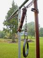
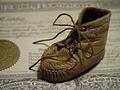
| 08/11/2002 08:03:00 PM |
Sole Survivorby LindaLeeComment: Nicely done! The composition is great. I like your use of DOF here - I don't think there is a need to see everything focused. One small thing, I wish there was just a tad more light on the shoe. A job well done!! 8 Ruthann |
| Photographer found comment helpful. |
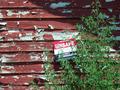
| 08/09/2002 05:12:00 PM |
unsafeby jbolingComment: Good use of lines...the diagonal shadow, the lines of the siding, the tree also gives a diagonal line. (I'm being frank - not to offend) As I look at this, the brightness of the sign is distracting. I feel as if there should be something else - as if part of a story has been left out. The image is not 'speaking to me'. 7 Ruthann |
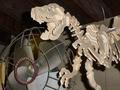
| 08/05/2002 07:22:00 PM |
Fanasaurus Rexby MagsCoyoteComment: Funny. I like the idea, yet not the photo...I'm being very frank in my comments - not to offend. The angle is good - different angles are usually good. I don't like the flash for the lighting - it makes it look too 'snap-shot' like. I'm not sure what the background is, but it doesn't work. I'm not sure what else to suggest. 4 Ruthann |
| 08/05/2002 10:36:00 PM |
Used & kept since 1898by pclongComment: Very well done. I like the lighting/coloring. I like that you can see the dimensions of the coins (no just flat). Very nice detail and great texture. Culture'ific!!! 9 Ruthann |
Home -
Challenges -
Community -
League -
Photos -
Cameras -
Lenses -
Learn -
Help -
Terms of Use -
Privacy -
Top ^
DPChallenge, and website content and design, Copyright © 2001-2025 Challenging Technologies, LLC.
All digital photo copyrights belong to the photographers and may not be used without permission.
Current Server Time: 08/21/2025 03:45:00 AM EDT.