| Image |
Comment |
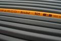
| 08/23/2002 10:30:00 PM |
One of a Kindby bdshortComment: Very Nice - (Running out of steam for commenting - so being brief) was this with a fisheye lens? I like this - good choice of color (and non color), good dof, composition and cropping - all great for this image - I see great time, effort, thought and skill for this image Great Work 8 Ruthann |
| 08/20/2002 02:47:00 PM |
|
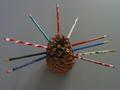
| 08/21/2002 09:05:00 PM |
Family Treeby bobgaitherComment: Cute idea. I'm being straight forward - NOT to offend. There are a few things I would adjust. I'm not sure that having the light source entering from the top right is effective here. I'm not sure if the background is actually grey, or was supposed to be black - either way, I would have chosen something different. Also, perhaps a different placement and angle - in effort to make the form stand out - to me, this is more of just a 'picture' not a photograph. Perhaps having the lightsource a little brighter as well as positioned differently, I would say on the side or in the front - show off the pine cone. I am in no way an expert, just expressing my thoughts. 4 Ruthann |
| 08/20/2002 02:41:00 PM |
v .00by GordonComment: Very simple, clean and well done. Great composition and angle. I like it very much. The choice of exposure suits this photo well. Great work. 10 Ruthann |
| 08/19/2002 10:28:00 AM |
|
| 08/23/2002 09:42:00 PM |
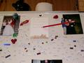
Honey Do Listby YomiComment: I can't figure out how the pencil was done - interesting. (I'm being straight forward - NOT to offend) Personally, this is not very appealing. For me, the cropping is too big, there's so much going on here that the pencil is lost. I'm curious as to why the top of the fridge is in the shot. Perhaps I'm missing something. Ruthann |
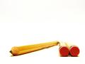
| 08/21/2002 08:36:00 PM |
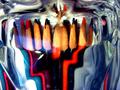
pencil distortionby shutterflyComment: very creative, i like the concept. i like all of the distortions and colors. Can't decide if I agree with the extra reflected light on the left - the way that it is lit on half. But I still appreciate the time and effort. Good work. 8 Ruthann |
 Photographer found comment helpful. Photographer found comment helpful. |
| 08/21/2002 03:03:00 PM |
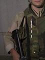
Pencil Guardby undergroundComment: Funny. I get the humor and I think I understand that the intent was to make the white pencil stand out. IMO (NOT to offend) I this does not work - too dark. I'm sorry, I don't have much more to say. Ruthann |
| 08/12/2002 11:24:00 AM |
|
| 08/19/2002 08:15:00 AM |
New Puppy!by evilbunneeComment: These are not insults - just comments. There have been much much worse. You need to take a step back and not read them with so much emotion. My first attempt here didn't go over all that well, but I'm still submitting and getting much much better (check out my Shadows entry) I've leaned a lot from those comments. Keep submitting - it's the best way to learn! |
Home -
Challenges -
Community -
League -
Photos -
Cameras -
Lenses -
Learn -
Help -
Terms of Use -
Privacy -
Top ^
DPChallenge, and website content and design, Copyright © 2001-2025 Challenging Technologies, LLC.
All digital photo copyrights belong to the photographers and may not be used without permission.
Current Server Time: 08/20/2025 06:44:11 PM EDT.