|
|
|
Showing 111 - 118 of ~118 |
| Image |
Comment |
| 05/14/2004 12:59:16 AM | |  Photographer found comment helpful. Photographer found comment helpful. |
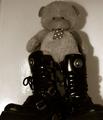
| 05/14/2004 12:58:16 AM | Hard & Softby kevrobertsonComment: Just my take, but between all of the different textures (vinyl, metal, fabric, plastic, cord, ribbon, felt, and two tones of wall) and lighting ambiguities, the image is too muddled to pull a good concept of "opposites" out of it. While I'm a fan of B&W, I think this one may have faired better in color. And taken from a slightly lower angle would have done very well in the "proportions" contest! | | Photographer found comment helpful. |
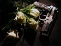
| 05/14/2004 12:54:11 AM | Mother Roseby JorelmComment: The thought behind the topic is strong. However, I find the paleness of the walkway too distracting to keep my attention on the shot at hand. Shot from another angle, producing a flatter background, could have provided the strength this shot needed. |
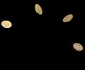
| 05/14/2004 12:49:23 AM | Life and Deathby pogboy4Comment: Absolutely vivid & bold. Great statement, and the natural fall-off of the light is top notch. My personal choice in this shot would have been to frame it where the "sun" was striking the roses from the petal side rather than stem side, but it's a choice for which I certainly can't fault someone else! | | Photographer found comment helpful. |
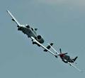
| 05/14/2004 12:47:37 AM | The Old and The Newby ronlcoxComment: While I think the concept is certainly solid, the color pallette is a bit too flat for my taste (stronger saturation, maybe?), and I also feel that this is one of those rare instances that I would want to see some motion blur on the subjects, just to get across the fact that they really aren't just hanging models. That's a personal choice though. |
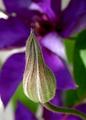
| 05/14/2004 12:44:46 AM | Open and Closedby vtruanComment: wonderful example of macro shooting. My only concern is that, in this particular case, the depth of field may be too shallow, keeping me from really grasping the concept of the open flower behind, thus pulling away from the challenge topic. The color, however, is absolute top-notch! | | Photographer found comment helpful. |
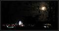
| 05/14/2004 12:41:53 AM | The Lights at Nightby LenMComment: I feel pretty strongly that there's too much going on in the shot, between the blurred city light, the wide variety of silouttes in the foreground, and the stong cloud gradient to firmly establish any secure hold on the topic. Taken from the other side of the brush, this would have stood a far better chance. | | Photographer found comment helpful. |
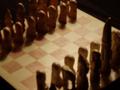
| 05/14/2004 12:37:27 AM | chessmenby MorbidAngelComment: I think this shot could have significantly benefited from harsher lighting (as it is, I really can't see the difference between the colors of pieces) and from a tighter focus/shallower depth of field. The idea, however, and the concept of "challenge" inherant in the shot are worth pursuing. |
|
Showing 111 - 118 of ~118 |
Home -
Challenges -
Community -
League -
Photos -
Cameras -
Lenses -
Learn -
Help -
Terms of Use -
Privacy -
Top ^
DPChallenge, and website content and design, Copyright © 2001-2025 Challenging Technologies, LLC.
All digital photo copyrights belong to the photographers and may not be used without permission.
Current Server Time: 08/18/2025 05:25:56 AM EDT.
|