| Image |
Comment |
| 09/18/2002 12:29:00 PM |
Untitledby JeBComment: I think this could be a little sharper. |
| 09/22/2002 11:42:00 PM |
upstreamby jimsikesComment: I don't know why, but I don't like the shadows here. I think the image would be stronger without them. |
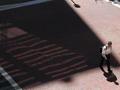
| 09/22/2002 11:39:00 PM |
Highway Fatalityby CLarson557Comment: For some reason this looks like a photograph you'd see on one of those unsolved murder shows. I'm not sure it's an optimal use for negative space, though. |
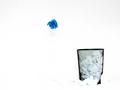
| 09/20/2002 08:23:00 PM |
Blew itby FrooberComment: I like this shot, but I think it would look better if the top of the background was pure white to match the rest of the shot. |
 Photographer found comment helpful. Photographer found comment helpful. |
| 09/21/2002 10:34:00 PM |
Framedby lmhrComment: Nice shot, but I think it would look better if it was well-centered. |
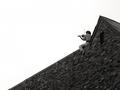
| 09/20/2002 08:27:00 PM |
Rollin' into it ...by sgtpepper6344Comment: After the challenge is over please explain your reasoning behind the negative space here. The challenge notwithstanding, I don't see a reason for it. |
| 09/18/2002 12:30:00 PM |
|
| 09/18/2002 12:38:00 PM |
crosswalkby austComment: I guess it's a cool billboard and all, but the shot doesn't really do it for me. |
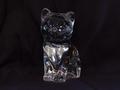
| 09/20/2002 08:31:00 PM |
Crystalby AntithesisComment: Sure there's negative space, but this doesn't really interest me and I'm not particularly fond of the composition. Try to work on different angles to make the photograph a little more interesting. |
| 09/20/2002 11:51:00 PM |
Romantic spotby habesComment: Nice shot! I think I might like it better if you got a little closer to the couple so they were a little clearer but without losing a lot of the neg space. |
Home -
Challenges -
Community -
League -
Photos -
Cameras -
Lenses -
Learn -
Help -
Terms of Use -
Privacy -
Top ^
DPChallenge, and website content and design, Copyright © 2001-2025 Challenging Technologies, LLC.
All digital photo copyrights belong to the photographers and may not be used without permission.
Current Server Time: 08/18/2025 03:50:19 PM EDT.