| Image |
Comment |
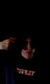
| 06/17/2004 01:29:04 PM |
Untitledby fallingretinaComment: Disturbing but well executed (pardon the pun!). Looks a tad blurry to me, and grainy as well. Perhaps a little tighter crop (not so much darkness at the top) would add more drama (not that there isn't enough already). Also - the hand and face look a little too pale and washed out. I think this would work in black and white as well. Tough subject matter. |
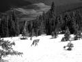
| 06/17/2004 01:26:58 PM |
Coyote Runningby DomromerComment: Some of the snow(?) seems blown out, and lacks detail. Perhaps your choice? I don't get the choice in the image... |
| 06/17/2004 01:26:10 PM |
Hat Choiceby NRRonComment: A tighter front on crop of just a bunch of hats with their wavy fronts would have been more impactfull and made for a more balanced, even colored picture. The t-shirts on the right, and the slight angle detract from this image. |
 Photographer found comment helpful. Photographer found comment helpful. |
| 06/17/2004 01:23:02 PM |
|
| Photographer found comment helpful. |
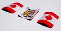
| 06/17/2004 01:22:19 PM |
3 Card Montyby ConcreteDonkeyComment: Looks like the choice has been made here. I would have left all three cards turned over. Very patriotic by the way. Good lighting. If you do turn over a card - a red card (perhaps ace of hearts), would have given this more of a leading line across the shot (with red diagnal being perceived as the line). Great concept though. |
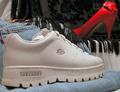
| 06/17/2004 01:21:02 PM |
Going Out or Staying In?by rubyrednailsComment: The jeans and the dress (with the tassles I assume) really only detract from this image. Just the shoes would have been enough given the title. Also - from the composition - looks like the decision is sneakers (which by the way you can go out and stay in with). |
| 06/17/2004 01:19:08 PM |
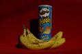
Healthy or NOT?by platy123Comment: This could be a better shot with more lighting. Most product shots try to reduce shadows by throwing multiple diffused light around - removing or reducing the shadows significantly (check out the almond bar photo in this contest - not mine). Also - I don't know how healthy those bananas look - I would have gone for more complete yellow to get the concept across. |
| 06/17/2004 01:17:30 PM |
|
| Photographer found comment helpful. |
| 06/17/2004 01:16:48 PM |
Vanity 5by bil99Comment: I guess I just don't get the choice here. To take the pill or not? To take all the pills at once? and what does the Vanity title mean? Sorry for my ignorance. Interesting photo though - with a nice tinge of the blue (Viagra?). Good work with the lighting as well. Is this a negative image? |
| 06/17/2004 01:14:44 PM |
MY choiceby Sheila_LawsonComment: I like the concept (and I don't know if its intentional), but the sky is missing! This is distracting to me, and loses some of the impact of the phoot. Also, I don't know who you are - so is your choice the two of them? or are you the guy and like the girl, or the girl and like the guy? Get what I mean? Focus on your subject and you'll be able to convey more. A tight crop of the face would better indicate who your "choice" is. |
Home -
Challenges -
Community -
League -
Photos -
Cameras -
Lenses -
Learn -
Help -
Terms of Use -
Privacy -
Top ^
DPChallenge, and website content and design, Copyright © 2001-2025 Challenging Technologies, LLC.
All digital photo copyrights belong to the photographers and may not be used without permission.
Current Server Time: 08/21/2025 08:57:26 AM EDT.