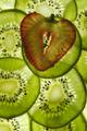
DPChallenge: A Digital Photography Contest You are not logged in. (log in or register
 
Browse Settings
Currently viewing:
Registered UserJesuispeure

Show comments:

Per page:

Order:

Comments:


Comments Made by Jesuispeure
Pages:   ... ...
Showing 221 - 230 of ~404
Image Comment
Baby Blues
05/19/2004 09:24:01 PM
Baby Blues
by debitipton

Comment:
Greetings from the Critique Club, and your daughter!

How weird out of all of the randomly alotted pictures, to be alloted yours for in-depth critique, hehehe...

Composition: This seems to be the main area of concern for your commenters. I don't think that the foreground is as distracting as they say, but I might have cropped in maybe a half inch on the bottom and an inch on the right hand side. Not in as far as one of your commenters suggested, but enough to draw the focus to the eggs a bit more. Try it- it might throw off the balance a little though.

TECHNICAL: (COMPUTER HAS GONE HAYWIRE AND CAPSLOCK WONT RELEASE) A LITTLE MORE DOF MIGHT HAVE HELPED WITH THE FOREGROUND, BUT RIGHT NOW IT FOCUSES NICELY ON THE EGGS. THE EXPOSURE SEEMS RIGHT ON, KEEPING THE COLORS RICH. I MIGHT DO A LIGHT BURN ON THE BRIGHT PARTS OF THE NEST NOW THAT YOU CAN EDIT IT AS YOU PLEASE.

APPEAL: IT APPEALS TO ME, BUT MANY OF THE VOTERS SEEM TO HAVE FOUND IT PRETTY MIDDLE OF THE ROAD. IT'S POSSIBLE THAT THEY EXPECTED SOMETHING MORE "WACKY" OR OUT THERE FOR THE SOMETHING NEW CHALLENGE.

FITTING THE CHALLENGE: I'VE NEVER SEEN YOU TAKE A PICTURE OF EGGS BEFORE, NOR HAVE I SEEN YOU CLIMBING TREES CAMERA IN HAND.

SORRY FOR ALL THE YELLING. DARM WORK COMPUTER!
AMANDA
Ensalada de fruta
05/19/2004 09:02:07 PM
Ensalada de fruta
by photom

Comment:
Greetings from the Critique Club!

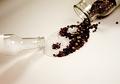
First of all, excellent job with the photo. It's a creative idea nicely executed. There are a few things though that I think would add to the picture.

Compostion:
This is the area I think you could improve the most. Like I said when I commented during the challenge, the strawberry on top of the kiwis is pretty muddy. I'm not sure you could have fixed this by thickening the strawberry slice as one commenter suggested. I think the strawberry would have turned out too dark, unless you used another light source, which might have gotten rid of the nice kiwi effect. I think the best bet would be to place the strawberry directly on the glass as well. Also, I might have moved the strawberry placement a little up and to the right to get the most out of the rule of thirds and add interest.

Technical: This was a very strong aspect of the picture. The focus is sharp throughout and the lighting excellent (minus muddy strawberry). The exposure also appears to be dead on.

Appeal: Typically I'm not a big fan of food pictures. They make me think of cheesy hotel art and mid-grade Italian restaurants. However, the creativity of this shot greatly enhances the appeal for me. That's just my two cents though.

Meeting the Challenge: It's creative, it attempts something new, and it's nothing like what you have already submitted. I think it works very well.

In closing, I think that if you would be willing to go through the pain of thinly slicing kiwi again to take another crack at this shot with a non-muddy strawberry (or maybe a more translucent fruit? Oranges? oooh... that could be cool) I think it would be worth your while.

Good job!
Amanda
Photographer found comment helpful.
Darkness and light...eternally opposed
05/17/2004 09:37:39 AM
Darkness and light...eternally opposed
by geewhy

Comment:
Very nice. I like the diagonal a lot. There is some noise in the trees, but not too bad. 8
Photographer found comment helpful.
Sunshine and shade
05/17/2004 09:36:15 AM
Sunshine and shade
by Andelain

Comment:
It's a very nice landscape picture. I like the way the sun catches the horizon, but it doesn't say much about opposites to me.
Photographer found comment helpful.
Black and White People
05/17/2004 09:35:16 AM
Black and White People
by BKerr

Comment:
There's a lot of noise in this shot, and a slight tilt, but the contrast is very nice. A nice candid shot!
Photographer found comment helpful.
Natural v. Man-Made
05/17/2004 09:33:46 AM
Natural v. Man-Made
by alisasaur

Comment:
I would have liked to see this shot in color. I think it might have made the make-up pop more. I would have liked there to be more contrast, but I like the cropping and composition a lot.
Photographer found comment helpful.
When a MAN loves a WOMAN
05/17/2004 09:31:56 AM
When a MAN loves a WOMAN
by UNCLEBRO

Comment:
The wrinkles on the screen are very distracting. There's a lot of mood in this shot, but I feel like there's not enough contrast.
Photographer found comment helpful.
Opposite ends of writing
05/17/2004 09:29:08 AM
Opposite ends of writing
by °°gummi°°

Comment:
It's a little noisy. I like the sepia tone and the angle very much.
Photographer found comment helpful.
Cold - Hot
05/17/2004 09:28:02 AM
Cold - Hot
by tyrkinn

Comment:
Interesting idea and nice DOF. A little more ice or something cold might have helped make the opposite pop more.
Photographer found comment helpful.
Seasoned Ying and Yang
05/17/2004 09:26:03 AM
Seasoned Ying and Yang
by dccloss

Comment:
Interesting take! It's little oversharp on the pepper kernels. That must have taken a long time!
Photographer found comment helpful.
Pages:   ... ...
Showing 221 - 230 of ~404


Home - Challenges - Community - League - Photos - Cameras - Lenses - Learn - Help - Terms of Use - Privacy - Top ^
DPChallenge, and website content and design, Copyright © 2001-2025 Challenging Technologies, LLC.
All digital photo copyrights belong to the photographers and may not be used without permission.
Current Server Time: 08/24/2025 09:02:17 AM EDT.