| Image |
Comment |
| 02/14/2005 10:14:59 AM |
Not Rockwellby graphicfunkComment: I like the expression very much, and the painter theme works well for me. Unfortunately, the high key background is so brilliant that I feel it distracts from the subject. An uncluttered natural backdrop would feel more at harmony in this image to me. |
 Photographer found comment helpful. Photographer found comment helpful. |
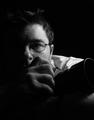
| 02/14/2005 10:13:39 AM |
Me, myself and Iby kevrobertsonComment: I like the natural feel to this exporession; It doesn't have an artifical feel to it. Also like your choice of lighting. Nicely done. |
| Photographer found comment helpful. |
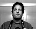
| 02/14/2005 10:13:30 AM |
Gangsta'by postoakinversionComment: Great lighting and post processing - not too overdone, but has a very professional feel to it. |
| Photographer found comment helpful. |
| 02/14/2005 10:13:21 AM |
Self-Portrait of NGEby ngefComment: The background trim piece's intersection with the subject's head is distracting. I'm also not comfortable with the way the camera is cut off, and a partial finger is showing. I think a different perspective and some cropping would go a long way. |
| Photographer found comment helpful. |
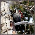
| 02/12/2005 09:24:25 PM |
Woodpecker.jpgby artvetComment: This is a Pileated Woodpecker... Not an easy bird to get a clean shot at, so just havig it outweighs the technical flaws in this shot (branch obstructions, etc.). I haven't been able to get one yet, but have been trying. Nice job! |
| Photographer found comment helpful. |
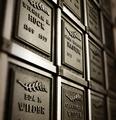
| 01/31/2005 02:55:56 PM |
Time Chambersby KylieComment: I've been struggling with a cemetary project lately, and must say that I think this is a successful image. Your use of depth of field suggests to me an expanse of these plaques while retaining a macro perspective. It's a touch soft in the foreground, which I think is the only real distraction. The detail within DOF is excellent, as is the lighting. On its own, I'm not sure this shot will reach its potential. However, I believe it couls be the foundation for an outstanding photo essay, tritych, or portfolio. I encourage you to keep its momentum... |
| Photographer found comment helpful. |
| 01/13/2005 09:37:37 AM |
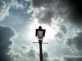
Heaven take 1by thewritersideComment: Your stated goal: "My goal was to detail the magnificence of the sky, using the lamp post to set the scale. My goal in posting was to get suggestions on what would allow me to fully achieve that goal, and to see if a shot like that would have mass appeal."
In this image the focus is sharply on the lamp post with blurring of the clouds. As you did not post atechnical information it's hard to know what you were working with, but as a guess I'm thinking you would better achieve your goal with a deeper depth of field; perhaps you could use a aperture priority setting to get to f/16?
It's also interesting that you wanted to set the scale with the lamp post. By using a wide-angle up close you emphasize the post dramatically. in this case, unless your goal was to create a surreal effect of a larger than life post, it may not have been the desired outcome.
As far as the sky's magnificence, I think your use of negative space does create a strong presence. With some curves work you could probably bring out more drama in the tonality of those clouds, adding contrast and interest.
I'm not sure this would be a mass appeal image in a challenge, although it would score as a technically sound image (which is definitely is). For some reason I feel that you'd boost its appeal with a duotone (b/w or sepia) treatment. I don't think color adds to this image, and sometimes simplifying can make a difference.
Hope this was helpful... Thanks for sharing.
|
| Photographer found comment helpful. |
| 01/12/2005 08:53:59 PM |
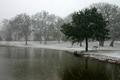
IMG_0548snow11.jpgby L1Comment: I like the subtle use of selective desat in this. It doesn't jump out as being unatural, yet it creates a unique effect. Creative work! |
| Photographer found comment helpful. |
| 11/22/2004 10:52:35 PM |
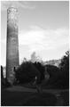
The Watchtowerby BrookiedComment: I'd like to see better lighting on the foregrouns statue to create play between it and the background tower. Seems like they would be good together. As it is, the foreground statue is a bit too dark to really latch onto. |
| 11/22/2004 10:01:06 PM |
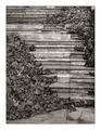
On a sunday afternoonby jjbeguinComment: Very skilled use of space, and I like the duotone treatment. This is a great image - I predict you'll sell many prints. |
| Photographer found comment helpful. |
Home -
Challenges -
Community -
League -
Photos -
Cameras -
Lenses -
Learn -
Help -
Terms of Use -
Privacy -
Top ^
DPChallenge, and website content and design, Copyright © 2001-2025 Challenging Technologies, LLC.
All digital photo copyrights belong to the photographers and may not be used without permission.
Current Server Time: 08/19/2025 06:26:37 PM EDT.