| Image |
Comment |
| 05/05/2004 06:58:58 AM |
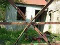
gate viewby JACKIE BIRDComment: Looks like the lighting overesposed part of the background shed near the center of the bars. This was a bit distracting to me. |
 Photographer found comment helpful. Photographer found comment helpful. |
| 05/05/2004 06:57:25 AM |
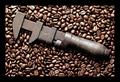
Rust never sleeps. (now we know why)by BradComment: So maybe I'm biased because I'm a tool freak, but I really am impressed that you thought of (what seems to be) coffee beans as a background. They create a perfect contrast! This kind of image is exactly why I joined DPC - thank you! |
| Photographer found comment helpful. |
| 05/05/2004 06:54:38 AM |
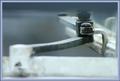
Rusty Paintingby frogsComment: I like to DOF on this image, and the blueish tone throughout. It's always interesting when a picture really conveys a mood to me, and this one does. |
| Photographer found comment helpful. |
| 05/05/2004 06:52:08 AM |
I am bit rusted, sryby kinksComment: Seems to be a stretch on the rust theme, but I think this could have come from National Geographic. Excellent photo. |
| Photographer found comment helpful. |
| 05/05/2004 06:51:27 AM |
Old Abandoned Tractorby SammieComment: Seems a bit overexposed; i think some additional shadow would have made the engine area more dramatic. |
| Photographer found comment helpful. |
| 05/05/2004 06:49:38 AM |
Nailby faidoiComment: Nice shadow in this picture, but seems a little to bright on the nail |
| Photographer found comment helpful. |
| 05/04/2004 10:20:33 AM |
|
| 05/04/2004 10:18:35 AM |
A little boy's dreamby DefyTimeComment: This would have been more interesting to me if the DOF focused more on the mini-car, slightly obscuring the camaro. In this image, the other full size cars distract from the main focus which seems to be the mini-car. |
| Photographer found comment helpful. |
| 05/04/2004 10:15:56 AM |
Reaching for a dreamby bobdaveantComment: The proportion aspect is very cool in this shot. The two subjects seem to be slightly rotated counter-clockwise, and just far enough off-center as to be a little distracting. Very creative composition! |
| Photographer found comment helpful. |
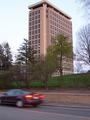
| 05/04/2004 10:14:01 AM |
Van Hise at Duskby dalee18Comment: This photo is missing the "catch" element. (Or maybe I'm missing it!). It needs something of interest to grab the eye. The sky also seems to compete with the building for attention. Might have been better with a bit less light, or more exposure compensation, although that would make the lower part difficult to expose. |
Home -
Challenges -
Community -
League -
Photos -
Cameras -
Lenses -
Learn -
Help -
Terms of Use -
Privacy -
Top ^
DPChallenge, and website content and design, Copyright © 2001-2025 Challenging Technologies, LLC.
All digital photo copyrights belong to the photographers and may not be used without permission.
Current Server Time: 08/19/2025 11:18:26 PM EDT.