| Image |
Comment |
| 05/15/2004 01:14:23 AM |
The Gameby MrZedComment: The concept of this shot fits the challenge well. The focus seems a little soft and the contrast could be bumped up a little, but the translucence of the pieces may make that a little difficult. (Do you realize that the rook and knight are reversed?) |
 Photographer found comment helpful. Photographer found comment helpful. |
| 05/15/2004 01:10:41 AM |
"Life and Death"by tfarrell23Comment: I like the starkness of the colors and the shadow - the long format composition supports that well. I wish the very edge of the palm fronds weren't cut off - or maybe they should be cropped a little more. |
| Photographer found comment helpful. |
| 05/15/2004 01:07:13 AM |
|
| Photographer found comment helpful. |
| 05/15/2004 01:01:18 AM |
Fire & Iceby mandypComment: Really lovely abstraction of the idea of fire and ice. The highlights in the foreground are great as is the off centered composition. |
| Photographer found comment helpful. |
| 05/15/2004 01:00:11 AM |
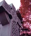
Permanance in Changeby jcurran25Comment: Nicely framed and the duotone choice is very interesting. I'm having a little trouble fitting it into the challenge - the trees representing life is a little difficult because they're not really included in the subject, they are merely a background. |
| 05/15/2004 12:58:34 AM |
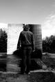
The Light and the Darkness Aheadby theantonComment: I like the balance to this and at the same time its lack of symmetry. Of course black and white is a natural choice for this and I appreciate that the contrast isn't too blown out. |
| Photographer found comment helpful. |
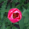
| 05/15/2004 12:55:04 AM |
Flower and Weedsby bobdaveantComment: Beautiful colors and DOF. I like the darkness at the center of the flower. The weeds don't come through as an example of opposition. A different view might be more appropriate for the challenge if you were to maintain the subject, but this photo is really lovely. |
| Photographer found comment helpful. |
| 05/15/2004 12:52:13 AM |
Go and Stopby willtataComment: Great simplicity - I like the imperfection in the center of the sign but the diagonals at the corners bother me a bit. The colors are great and the choice for the challenge is really refreshing. |
| 05/14/2004 05:58:25 PM |
Opposites Attractby rmlutgenComment: An interesting take - a large dog, a small dog, a curly haired dog, a straight haired dog, a white dog, a black dog. I might have liked to see the black dog more in frame or the white dog cropped out a little more. Nice balance - the background of a neutral red helps. |
| Photographer found comment helpful. |
| 05/14/2004 05:56:29 PM |
The Optimist and the Pessimistby L1Comment: A very interesting set up for this challenge. I like the forced perspective, showing that it is point of view that allows one to judge something as a positive or negative. I would have liked to see a little higher contrast to this shot. Very well done. |
| Photographer found comment helpful. |
Home -
Challenges -
Community -
League -
Photos -
Cameras -
Lenses -
Learn -
Help -
Terms of Use -
Privacy -
Top ^
DPChallenge, and website content and design, Copyright © 2001-2025 Challenging Technologies, LLC.
All digital photo copyrights belong to the photographers and may not be used without permission.
Current Server Time: 08/05/2025 04:54:30 AM EDT.