| Image |
Comment |
| 05/08/2006 06:56:18 PM |
everything comes to him who waitsby cordobesComment: I kind of like the moody lighting and soft focus, but it would have helped if the pic was a little bigger. I can't tell what's in the bottom/foreground there. |
| 05/08/2006 06:55:44 PM |
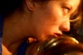
oops im toungue tiedby angeldelightComment: An interesting way of looking at the phrase. The subject isn't completely centered and could have been a bit bigger (if you wanted to). |
| 05/08/2006 06:54:42 PM |
I'm so Lonesome I Could Cryby kuhnsherComment: I like the subject of the dog and the expression, but the size of the photo is a little small for making out the detail. I'm missing the eyes, especially, which could have really sold this saying. |
| 05/08/2006 06:53:42 PM |
Birds of a feather flock togetherby lambie83Comment: Very interesting take on the saying! I like the colors and balance and even the angle. However, I'm not really keen on the little dusty bits in the frame and the slightly tipped horizon. If it were angled a bit more, I'd be okay, but it's in that range that just looks a little off. 5 |
 Photographer found comment helpful. Photographer found comment helpful. |
| 05/08/2006 06:51:38 PM |
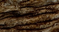
chip off the old blockby santosComment: The grains of the wood look rather like stormy waves of the sea. The contrast is a little dim and the shot could benefit from better framing of some more compelling part of the wood or perhaps a more interesting angle. 4 |
| Photographer found comment helpful. |
| 05/08/2006 06:47:55 PM |
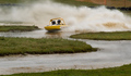
To Zig or to Zagby HeavyComment: Nicely framed to show the path of the boat. The speed is evident and the colors pop nicely. It could use just a little more contrast (IMO). |
| Photographer found comment helpful. |
| 05/08/2006 06:47:08 PM |
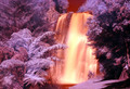
Come Hell Or High Waterby 3DsArcherComment: It's an interesting saying, but the waterfall doesn't really illustrate it for me. That said, it's a very interesting shot the way you've shifted the colors to give it that eerie, otherworldly quality. |
| Photographer found comment helpful. |
| 05/08/2006 06:46:13 PM |
|
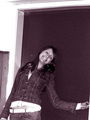
| 05/08/2006 06:46:04 PM |
Please take a picture of me!by Boris the bladeComment: The tilt of the frame doesn't help the composition here. I like the grainy quality and the monochrome, but that little strip of white in the lower right and the space above her head kind of distracts from the focus on the subject. 4 |
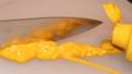
| 05/08/2006 06:44:41 PM |
Cut the Mustardby RMyers1314Comment: A nice idea and a good composition but not quite well executed. The little band of black up in the corner is distracting. I like the reflection on the knife.
Of course it could be in sharper focus. 4 |
| Photographer found comment helpful. |
Home -
Challenges -
Community -
League -
Photos -
Cameras -
Lenses -
Learn -
Help -
Terms of Use -
Privacy -
Top ^
DPChallenge, and website content and design, Copyright © 2001-2025 Challenging Technologies, LLC.
All digital photo copyrights belong to the photographers and may not be used without permission.
Current Server Time: 07/31/2025 03:35:16 PM EDT.