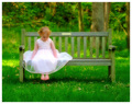
Lady in Waiting
by
timfythetooComment: Congrats on the 3rd place here !
I'm gonna' be the odd one out here and say that this image really hurts my eyes looking at it.
I know the punch was what you were intending on doing (
I know your PP too well to know it wasn't an oops) but oh man this is a bit over the top. For grins, I took it into PS and did Image, Levels, Options (
I set my defaults to enhanced per channel contrast, clips set to 0.5% shadow & 0.5% Highlights) and hit OK. That took the overall greens down enough and upped the black levels doing nothing more than that. Then in Hue/Saturation Red channel, shifted the Hue to +3%, Saturation to +3% and the Lightness to +12%. Still retains the glow, adds a bit of depth, pops the trees a bit better and eases the over-saturated greens a bit.
Take no offense to my 0.02 cents on this, as you knew exactly what you wanted, and seems the voters agreed. Glad you please yourself first on this and will be adorning the walls of your home with it.
ETA
I wish I would pay more attn to my spelling and wouldn't have had to edit this - was spelling only.Message edited by author 2008-05-26 21:52:04.