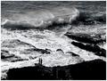
| Image |
Comment |
| 04/17/2004 01:51:03 PM |
|
 Photographer found comment helpful. Photographer found comment helpful. |
| 04/17/2004 01:49:07 PM |
Would YOU mess with this one?by rmahanComment: Definitely a stong animal. The texture on the fir is nice. Improvement areas: 1) Needs more light on the face - perhaps fill flash of wait until he turns his head a bit to his left. 2) The out-of-focus white brach in the upper right corner is very distracting 3) The white trunk behind the animal leads your eye up and out of the frame. |
| Photographer found comment helpful. |
| 04/17/2004 01:45:22 PM |
The Power Of Loveby gambaComment: It a nice portrait - but the palm on the left side is bothersome. I don't think there is much strength shown here, but the title forces the thought. |
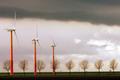
| 04/17/2004 01:42:58 PM |
Colourful Windpower after the Rainby simbambaComment: Nice seeing - wonderful use of repeating shapes. Composition great, colors very effective. The only thing that detracts from this picture for me are the powerlines, poles and building in the very background. |
| Photographer found comment helpful. |
| 04/17/2004 01:40:49 PM |
strength of animal/human bondby whiteroomComment: Nice use a the black bbackground - makes the hair and green lizards pop. Improvement area: 1) The closest lizard's face is just falling into shadow. 2) Shallow DOF make the back lizard soft. 3) The white spot at the end of the eyebrow does nothing for me. 4) The title - I'm probably wrong but don't think there's much bonding with this species. |
| 04/17/2004 01:35:49 PM |
economic strengthby fstopopenComment: Nice silhouette. Colors very nice. The merger of the pump with the top of the frame is a bit disturbing. |
| Photographer found comment helpful. |
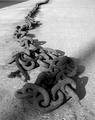
| 04/17/2004 01:33:28 PM |
Chain Reactionby JokullComment: I like the diagonal composition. ot sure there are any true whites in the printing. The dark triangle in the upper left corner is a bit distracting. |
| 04/17/2004 01:30:51 PM |
|
| Photographer found comment helpful. |
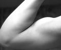
| 04/15/2004 06:14:31 PM |
The Power Of Manby DamianComment: Black and white was a good choice for this. Don't like the "haze" abot the arm in the upper left. |
| Photographer found comment helpful. |
| 04/15/2004 05:58:10 PM |
Strength is in the Cardsby rudacbComment: Nice studio setup - like the use of all black and white in a color photo. I think the lighting seup could have been better executed as the top of the glass seems a bit weak. Both the left and right side of the top of the glass tend to merge into the background. |
| Photographer found comment helpful. |
Home -
Challenges -
Community -
League -
Photos -
Cameras -
Lenses -
Learn -
Help -
Terms of Use -
Privacy -
Top ^
DPChallenge, and website content and design, Copyright © 2001-2025 Challenging Technologies, LLC.
All digital photo copyrights belong to the photographers and may not be used without permission.
Current Server Time: 08/25/2025 04:40:14 PM EDT.