| Image |
Comment |
| 05/02/2004 11:46:35 AM |
|
 Photographer found comment helpful. Photographer found comment helpful. |
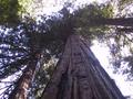
| 05/02/2004 11:45:13 AM |
Redwoodby axsdenyComment: It seems a little flat -- perhaps some more density in the mid-range (in photoshop/levels/ slide the middle -- gray -- slider to the right) would dramatically improve the shot. Also, since the sky is almost totally blown out, re-shooting with less exposure would be appropriate as well. |
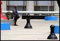
| 05/02/2004 11:39:54 AM |
Checkmateby zwhitleyComment: Really nice shot -- should rank well. I'm a little disapointed with the funny black triangle in the upper-right corner. It seems that a step or two forward or backward (to include it as an element) would have been advisable. |
| Photographer found comment helpful. |
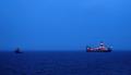
| 05/02/2004 11:36:24 AM |
|
| Photographer found comment helpful. |
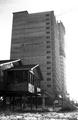
| 05/02/2004 11:34:06 AM |
Make Room For the Big Boysby skyjackComment: The exposure is pretty far off -- the whole right side is over exposed. In the future, there are a couple of things to try: if your camera has exposure lock, set the exposure on the right side, then re-frame the image to compose it the way you want. Also, it looks like you were shooting into the sun. You could stand on the opposite side of the big building (with the sun at your back). This would also have the effect of exaggeration -- making the big building look bigger and the small building look smaller. |
| 05/02/2004 11:29:51 AM |
|
| Photographer found comment helpful. |
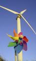
| 05/02/2004 11:26:35 AM |
"Meet Daddy...."by PatrolComment: You've really nailed the idea for the challenge -- good light too. My only critical comment would be that the pinwheel is too central -- I'd like to see it more to the left -- I want to instantly know that the stick of the pinwheel isn't part of the windmill. As is, it takes a moment to 'read' it as separate objects. Should score well within the top 30!! |
| Photographer found comment helpful. |
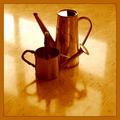
| 05/02/2004 11:21:35 AM |
Tin Tangoby AlexHugelComment: That's an attractive composition and nicely lit & shot, but the duotone color is a little much for my taste. |
| Photographer found comment helpful. |
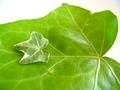
| 05/02/2004 11:19:51 AM |
Small Leaf, Big Leafby SedenComment: good idea, the lighting is a little flat. I think the DOF is neither here nor there -- it's not blurry enough to be a "technique" but not sharp enough to feel complete. Shooting from further away but zooming in, and manually setting a small apeture will help achieve a full-frame focus. |
| Photographer found comment helpful. |
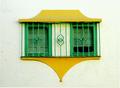
| 04/28/2004 01:35:15 PM |
el maximilianoby rananculusComment: I can't quite place why, but it looks like it's not level -- but all the horizontal lines are right. I want to see a little more detail in the white walll -- it's a bit over-exposed. Ncie colors tho. |
| Photographer found comment helpful. |
Home -
Challenges -
Community -
League -
Photos -
Cameras -
Lenses -
Learn -
Help -
Terms of Use -
Privacy -
Top ^
DPChallenge, and website content and design, Copyright © 2001-2025 Challenging Technologies, LLC.
All digital photo copyrights belong to the photographers and may not be used without permission.
Current Server Time: 08/04/2025 09:28:26 PM EDT.