| Author | Thread |
|
|
05/05/2004 05:39:53 AM |
(minkia guagliò: "47" - il morto che parla!!!)
;-)
Sorry but "47" has a meaning only for Italians (Naples surroundings especially) |
|
|
|
05/05/2004 05:35:23 AM |
Thank you everyone for the useful comments. You're maybe right, I should have not add the borders or at least not of this colour. Until now this is my highest rated picture and I must say I'm pretty much satisfied with it. Have a great day whoever you are wherever you live !
Alex
Message edited by author 2004-05-05 05:36:49. |
|
Comments Made During the Challenge  |
|
|
05/04/2004 04:56:39 PM |
|
Great photo. I love it. Square has its place and this is it. |
|
 Photographer found comment helpful. Photographer found comment helpful. |
|
|
05/04/2004 02:20:37 AM |
|
nice colors and overall pic |
|
| Photographer found comment helpful. |
|
|
05/03/2004 11:39:42 PM |
|
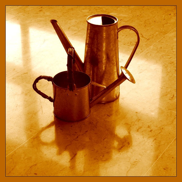
Nice image, love the reflections and the shadows. The warm tone really works too. |
|
| Photographer found comment helpful. |
|
|
05/03/2004 06:30:55 PM |
|
Beautiful color. This is an excellent shot. |
|
| Photographer found comment helpful. |
|
|
05/03/2004 09:26:54 AM |
|
Excellent! Great lighting, props, colors and shadows. When you have a photo this good all an obvious border can do is detract. |
|
| Photographer found comment helpful. |
|
|
05/02/2004 02:22:35 PM |
|
This photo is a real beauty! Well-tempered colour-tones and a composition on the edge of what could be accepted/expected. I'm sorry to say that the border is dragging my impression down, and also the points given... |
|
| Photographer found comment helpful. |
|
|
05/02/2004 11:21:35 AM |
|
That's an attractive composition and nicely lit & shot, but the duotone color is a little much for my taste. |
|
| Photographer found comment helpful. |
|
|
05/01/2004 11:10:49 PM |
|
Well done. I like the colors. |
|
| Photographer found comment helpful. |
|
|
05/01/2004 04:16:05 PM |
|
the title makes this a really great pic, really made me laugh, i often see objects as characters which throws a completely different slant - 9 from me - good luck |
|
| Photographer found comment helpful. |
|
|
05/01/2004 02:47:13 AM |
|
Love the warmth and color. The contrast is very nice. Lose the border and crop it tighter at the bottom and it would be fantastic! 8 |
|
| Photographer found comment helpful. |
|
|
04/30/2004 03:44:03 PM |
|
Nicely done. I would reconsider the unflattering border. |
|
| Photographer found comment helpful. |
|
|
04/30/2004 11:54:35 AM |
|
Nice idea. Colors work well together; the diagonal lines of the floor add impact. I don't particulay like: a) The placement of the watering cans in relationship with each other (the mergers of the little can's sprinker head with the handle of the larger can and the little can's handle with the larger spout) b) the border detracts. |
|
| Photographer found comment helpful. |
|
|
04/30/2004 10:40:44 AM |
|
Very pretty picture with nice mood enhanced by the reflections. The border does nothing for this, but I won't mark points down for that. |
|
| Photographer found comment helpful. |
|
|
04/30/2004 09:49:24 AM |
|
| Photographer found comment helpful. |
|
|
04/29/2004 09:48:26 PM |
|
I like the setup but feel there is too much of the same colour.Although I do like it. |
|
| Photographer found comment helpful. |
|
|
04/29/2004 02:00:35 PM |
|
Wow -- very nice! I like the tones and the sharpness here. The reflection from the window also adds some character to it. A 10 in my book. |
|
| Photographer found comment helpful. |
|
|
04/29/2004 07:13:59 AM |
|
not enough variety in the colors |
|
| Photographer found comment helpful. |
|
|
04/29/2004 06:49:33 AM |
|
| Photographer found comment helpful. |
|
|
04/28/2004 05:47:12 PM |
|
I don't find this a pleasing arrangement of these two watering cans. If it weren't for the title I would wonder why you chose to place them like this. This just doesn't work for me. |
|
| Photographer found comment helpful. |
|
|
04/28/2004 02:45:44 PM |
|
These colors and shapes work well for me. Good focus all throughout the photo. |
|
| Photographer found comment helpful. |
|
|
04/28/2004 01:27:00 PM |
|
i love the color and light... nice |
|
| Photographer found comment helpful. |
|
|
04/28/2004 11:02:12 AM |
Composition: Subject Placement, Cropping, Background 5
Technical: Focus, Exposure, Lighting, Processing 5
Appeal: Is it Interesting, Motivating, Etc.? 4
How well does it meet the challenge: 5
Total Averaged Rating 5 Autool
|
|
| Photographer found comment helpful. |
|
|
04/28/2004 07:44:58 AM |
|
I love the way the colors in the cans and floor compliment each other. Really like this! |
|
| Photographer found comment helpful. |
Home -
Challenges -
Community -
League -
Photos -
Cameras -
Lenses -
Learn -
Help -
Terms of Use -
Privacy -
Top ^
DPChallenge, and website content and design, Copyright © 2001-2026 Challenging Technologies, LLC.
All digital photo copyrights belong to the photographers and may not be used without permission.
Current Server Time: 06/28/2026 04:48:10 PM EDT.