| Image |
Comment |
| 06/11/2004 02:01:29 PM |
Waiting for eternityby tony2244Comment: The background in this shot looks too much like the foreground- it is hard to tell where one stops and the other begins, particularly on the left hand side. Some light on the forground might help it stand out more. |
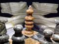
| 06/11/2004 01:59:23 PM |
Your Move!by timganierComment: Nice idea, but I think there is some room for improvement. In particular, I think the flash is a little too strong and harsh for this shot. A softer light might improve the hard, cold washed out look of the picture and add warmth to the pieces without the harsh glare. |
 Photographer found comment helpful. Photographer found comment helpful. |
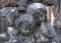
| 06/11/2004 11:28:11 AM |
Waitingby evenendresenComment: Nice picture. I like the idea and feel, but I'm not a fan of the blue tint. Also, the candle placement and brightness draw the eye to them and the clock as the focal point of the image and it almost seems like the woman was thrown in as an afterthought. I will acknowledge that those elements are instrumental in creating the feel of this photo, like the woman IS an afterthought, but I can't help but wonder if the same effect could be achieved without the blue and with some careful lighting on the woman. Despite those factors, I still like this shot. :) |
| Photographer found comment helpful. |
| 06/11/2004 08:56:35 AM |
|
| Photographer found comment helpful. |
| 06/11/2004 08:53:15 AM |
Ho Humby BobsterLobsterComment: Very interesting shot. Great job with the lighting and metering (or photoshop!) to have the background washed out but still have the subject properly exposed. |
| Photographer found comment helpful. |
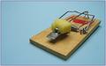
| 06/11/2004 08:48:26 AM |
The hunter silently Waitsby KiwiChrisComment: Overall, very nice. I like the clever interpretation of the challenge. I think the lighting is a little flat and makes the cheese look kind of dark. Some soft sidelighting coming from the lower right might add some more dimension and contrast to the shot. Still, I like this one. |
| Photographer found comment helpful. |
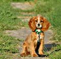
| 06/10/2004 04:34:26 PM |
W a i t i n gby daisytxComment: Great shot and cute dog! Unfortunately the background is kind of ugly... Maybe a tighter crop and a shallower depth of field would help hide it. |
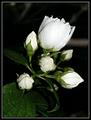
| 06/10/2004 04:32:11 PM |
Ready to Blossemby TikicharmComment: The focus looks a bit soft in some areas of the flower. It also looks a little underexposed to me. I would prefer some more light on the leaves to help them stand out from the background. |
| Photographer found comment helpful. |
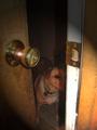
| 06/10/2004 04:29:56 PM |
waiting for my best friendby spitz66Comment: I think some creative lighting could improve this shot a lot. The shadow the flash casts on the dog's face looks funny. The bright doorjamb is the only part of the photo that stands out. I think some back lighting from inside the house would focus attention on the dog and not on the scratched up door. |
| Photographer found comment helpful. |
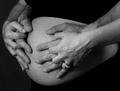
| 06/10/2004 04:23:52 PM |
soonby grigrigirlComment: Another four armed pregnant woman! (and another humerous comment on the composition of a shot...) |
Home -
Challenges -
Community -
League -
Photos -
Cameras -
Lenses -
Learn -
Help -
Terms of Use -
Privacy -
Top ^
DPChallenge, and website content and design, Copyright © 2001-2025 Challenging Technologies, LLC.
All digital photo copyrights belong to the photographers and may not be used without permission.
Current Server Time: 08/18/2025 09:47:19 AM EDT.