| Image |
Comment |
| 05/19/2004 01:39:27 PM |
|
 Photographer found comment helpful. Photographer found comment helpful. |
| 05/19/2004 01:37:24 PM |
|
| 05/19/2004 01:35:55 PM |
Midnight Secretby janoComment: Very mysterious. I like that it's out of focus, it emphasizes that you don't know what's going on here...don't listen to anyone that says it should be in focus. Very nice. |
| Photographer found comment helpful. |
| 05/19/2004 12:07:06 PM |
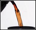
Morning essentials. by BradComment: I think this photo could be improved 100 percent if you caught the lip of the pitcher pouring out the coffee. Otherwise, brilliant photo. |
| Photographer found comment helpful. |
| 05/19/2004 11:56:14 AM |
Twice Dailyby BikeRacerComment: I think this may be the only 10 of the challenge (except for mine of course!)
Beautiful. |
| Photographer found comment helpful. |
| 05/19/2004 11:38:49 AM |
Shopaholicby johnmComment: Really nice photo, I love the composition and the fact that there is no glare coming from the window. Well done. |
| Photographer found comment helpful. |
| 05/19/2004 10:59:39 AM |
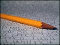
I will not...by MightyMouseComment: Really great idea, almost a 10, but I would have liked the paper to be a little whiter. maybe play with your light source a little more so the pencil really pops out at you. Otherwise, really great! |
| Photographer found comment helpful. |
| 05/19/2004 10:57:42 AM |
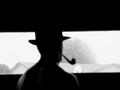
WATCHINGby jimmyxj95Comment: This would have been a 10 if what the man was looking at was more interesting/attractive to me. Very very nice indeed, composition, lighting, DOF. |
| Photographer found comment helpful. |
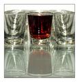
| 05/19/2004 10:45:35 AM |
shot after shot by joncd4Comment: I really like the composition and colors in this shot. The only thing that I would do is try to use a polaring filter (if you can use one on your camera) to eliminate the reflections and glare from the glass. This would make this shot a 10. |
| Photographer found comment helpful. |
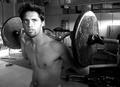
| 05/19/2004 10:27:33 AM |
Habituality Breathes Strengthby StangComment: This is a really nicely composed photo. The subject matter, the model's expression, the older looking weights, very nice. The only thing I would look to change is the background. It's a little distracting (the ladder, the screen door, broom, baseball bat). These all take away from what you are portraying. Also, the choice of black and white is good, but when shooting in b/w I would say your subject(s) should stand out from their background. In this case, the grays are too close together to really *pop* out at me. Otherwise, great shot. |
Home -
Challenges -
Community -
League -
Photos -
Cameras -
Lenses -
Learn -
Help -
Terms of Use -
Privacy -
Top ^
DPChallenge, and website content and design, Copyright © 2001-2025 Challenging Technologies, LLC.
All digital photo copyrights belong to the photographers and may not be used without permission.
Current Server Time: 07/31/2025 08:47:41 PM EDT.