| Image |
Comment |
| 10/20/2004 04:26:29 PM |
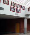
FORENSICSby medinfo2000Comment: The signs don't do enough to make me feel nostagic or inspired by the theme. 4, just-married |
 Photographer found comment helpful. Photographer found comment helpful. |
| 10/20/2004 04:25:28 PM |
|
| Photographer found comment helpful. |
| 10/20/2004 04:24:25 PM |
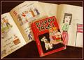
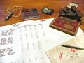
Roll Callby biggood53Comment: It feels like too many items all placed on a desk in a way that you would never really fiind them. I'd have preferred one or two items arranged in a thought-provoking way. Somehow this composition makes the image seem flat. 4, just-married |
| Photographer found comment helpful. |
| 10/20/2004 04:22:31 PM |
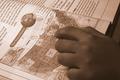
Study Hardby Travis99Comment: Composition is good, but I don't care for the sepia in this case. Perhaps it's to do with the phrase "right there in black and white" - somehow the text not being black bothers me. 5, just-married |
| Photographer found comment helpful. |
| 10/20/2004 03:42:29 PM |
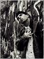
HE SAIDby medinfo2000Comment: This deserved better. I think B&W would have been interesting, but I like the blues. |
| 10/20/2004 03:33:16 PM |
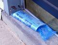
Street Signsby JPRComment: I think this type of shot in a top 20 spot is unexpected and speaks to how good a photo it is. Great job. |
| Photographer found comment helpful. |
| 10/20/2004 03:28:03 PM |
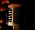
The Radio Announcerby wkoffelComment: Hmmm, ...lots of folks didn't like the composition, the heavy left side, or the tight cropping. I thought all three really worked for this photo. Perhaps it was the title that brought the whole thing together for me and gave the photo context. The inclusion of the mouth, but not the face, I though captured the essence of voice. We know our radio voices, but we don't ever see the faces or meet the people. Also the blackness on the right side called to mind the announcer's words going off into the void. He's there, he's working it, but he never really knows for sure who, if anyone, is listening. Well done. |
| Photographer found comment helpful. |
| 10/14/2004 01:56:50 PM |
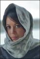
Big Eyesby cabaComment: She's just beautiful. The focus is a tad softer than I prefer and there's some strange banding on the left, buut great shot. |
| Photographer found comment helpful. |
| 10/14/2004 01:53:43 PM |
Street Signsby JPRComment: One of my top picks this week. Seems oversharpened, but it works very well here. |
| Photographer found comment helpful. |
| 10/14/2004 01:52:52 PM |
Guidance in Natureby tmilobComment: I would be very interested in seeing a larger copy of this; as it is, it's to small to assess. The colors seem very striking. It has a quality almost like a painting, but I doon't understand the size choice... 6 (could have been much higher)
bumped to 8 as I fine tune my votes. One of my top picks this week. |
| Photographer found comment helpful. |
Home -
Challenges -
Community -
League -
Photos -
Cameras -
Lenses -
Learn -
Help -
Terms of Use -
Privacy -
Top ^
DPChallenge, and website content and design, Copyright © 2001-2025 Challenging Technologies, LLC.
All digital photo copyrights belong to the photographers and may not be used without permission.
Current Server Time: 08/07/2025 05:39:56 PM EDT.