| Author | Thread |
|
|
10/20/2004 03:42:29 PM |
|
This deserved better. I think B&W would have been interesting, but I like the blues. |
|
Comments Made During the Challenge  |
|
|
10/19/2004 07:37:53 PM |
|
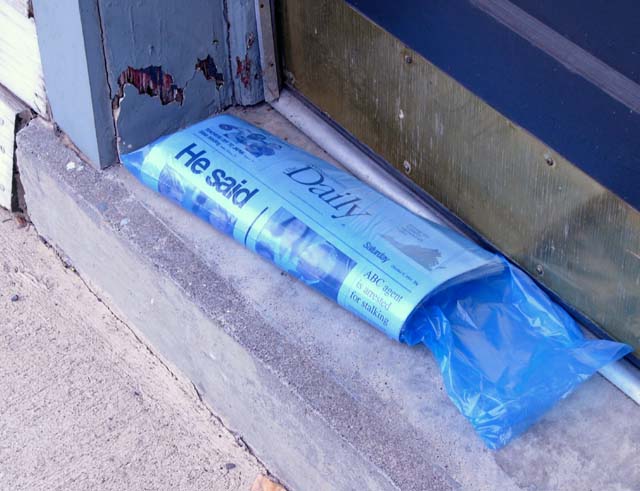
Very good take on the challenge. I love the title, so simple but so direct. |
|
 Photographer found comment helpful. Photographer found comment helpful. |
|
|
10/16/2004 10:42:04 AM |
|
| Photographer found comment helpful. |
|
|
10/15/2004 03:30:38 AM |
|
Just a little flat for me. No real point of interest. The headline ties you into the challenge, but it's certainly not a pretty photograph. I think, had you turned this into a B&W shot.. the gritty nature would have worked.. but in color, it's just too mundane. |
|
|
|
10/14/2004 01:43:16 PM |
|
I like it, particularly the blues. A border would have made this stand out more - there is too much gray in your photo to pop against the gray dpc background. |
|
| Photographer found comment helpful. |
|
|
10/14/2004 12:23:35 AM |
|
i really like how you made the headline on the paper your title, if you hadnt have done that i most likely would not have payed as much attention to it. the more i looked at it the more i liked it. its not a pretty porch, its real life. good angle, good compostion. i like this |
|
| Photographer found comment helpful. |
|
|
10/13/2004 06:48:44 PM |
|
what a good idea what did he say was it important good communication |
|
| Photographer found comment helpful. |
Theme:
Classic /
System /
Light /
Dark
Home -
Challenges -
Community -
League -
Photos -
Cameras -
Lenses -
Learn -
Help -
Terms of Use -
Privacy -
Top ^
DPChallenge, and website content and design, Copyright © 2001-2026 Challenging Technologies, LLC.
All digital photo copyrights belong to the photographers and may not be used without permission.
Current Server Time: 10/02/2026 05:29:30 PM EDT.






 Add photograph to your favorites
 Add photographer to your favorites


