| Image |
Comment |
| 01/22/2006 01:29:14 PM |
Defianceby ImagineerComment: bump to 10. Good luck!
Just terrific. You were on your feet and thinking fast. I love it. |
 Photographer found comment helpful. Photographer found comment helpful. |
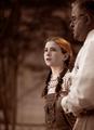
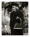
| 01/22/2006 01:28:16 PM |
Concertby GlouComment: There are a handful of images in this challenge that dared to be different, a thing apart from the typically accepted notion of beauty. This is one of them, and it is superbly executed. And now at the risk of sounding foolish, my curiosity must be satiated - are these brothers, or is this a repeat appearance of the same person? The eyes and noses are so similar, I can't help but wonder if this is one of those very clever images people have been trying since Kiwiness made his 30 appearances in church one morning. Either way, it is a remarkable image. I love the way the lighting shifts with the DOF. I love the mood in each man's face. Just really, really well done.
I fear it won't place as highly as I like among so many well-done mountain and water landscapes, but this is truly an art piece. |
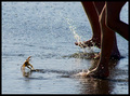
| 01/21/2006 06:59:30 PM |
Scout (and Atticus): after the confrontationby nsbca7Comment: Took this for a candid at first, and thought wow - you nailed the title. ;) My only cc is the way the lighting falls on her face (or perhaps as a result of processing) her face looks bw/gray and not flesh-toned. The framing is great; and the girl makes a terrific Scout. |
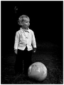
| 01/17/2006 11:16:53 PM |
A Toast to the Kids of the Worldby JPRComment: bump to 8.
I like it better without the adult's hand in the background. I know that alters the meaning of your title, bu tthe hand just kinda floating there with no interaction doesn't add anything meaningful to the shot for me. The child is beautiful and the processing in the image is just beautiful. 7 |
| Photographer found comment helpful. |
| 01/17/2006 11:13:21 PM |
|
| Photographer found comment helpful. |
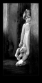
| 01/17/2006 11:09:41 PM |
self portraitby photogrlComment: bumped to 8
Interesting as an abstract, and the title probably saved this from the typical gloss over an abstract usually gets here. I think I would like it cropped further from the left so that the small white arch is not included. My eyes, drawn to the brightest points in the photos picked it out, and once knowing it's there, I cannot stop going back to it. Also, above the leg, there's a circular point of light: a lens flare, cloning remnants, a toe or shoe blurred by DOF? I can't tell, but I think cloning it out would add minutely to the image. 7 |
| 01/17/2006 10:40:21 PM |
|
| Photographer found comment helpful. |
| 01/16/2006 08:48:54 PM |
|
| Photographer found comment helpful. |
| 01/16/2006 05:17:14 PM |
|
| Photographer found comment helpful. |
| 01/16/2006 02:22:28 PM |
Coming out to playby CollYComment: Very nicely lit and composted. I like the choice of BW. Timeless and classic. 10 |
| Photographer found comment helpful. |
Home -
Challenges -
Community -
League -
Photos -
Cameras -
Lenses -
Learn -
Help -
Terms of Use -
Privacy -
Top ^
DPChallenge, and website content and design, Copyright © 2001-2025 Challenging Technologies, LLC.
All digital photo copyrights belong to the photographers and may not be used without permission.
Current Server Time: 08/04/2025 07:42:50 AM EDT.