| Image |
Comment |
| 07/19/2004 01:03:53 PM |
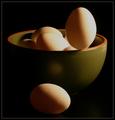
Going for the record!by ConcreteDonkeyComment: I like the image, the high contrast, superb focus, the improbable subject and the fact that you can just see the actor in this drama in the background. Well done. |
| 07/19/2004 01:02:11 PM |
Zenby JesuispeureComment: A fine image, well composed and focused. The border detracted from the image in my opinion. |
 Photographer found comment helpful. Photographer found comment helpful. |
| 07/19/2004 12:58:23 PM |
Balanced to perfectionby geewhyComment: This is a beautiful image. Subject matter is fantastic, colors terrific, balance and composition is virtually perfect. Great image. |
| Photographer found comment helpful. |
| 07/19/2004 12:56:37 PM |
egg-scape by instepsComment: This is a very nice image well composed and well shot. I am bothered by the jagged artifacts along the top edges of the eggs and in some of the reflected highlights on the bowl. It could be perfectly natural, but the shadow on the vertical egg looks out of synch with the shadows on the other eggs. Otherwise a 10. |
| Photographer found comment helpful. |
| 07/15/2004 12:32:00 AM |
Shadow's shadowby paha_lComment: Wow! I'd love to understand how you did this. Innovative shot. Hope it does well. |
| Photographer found comment helpful. |
| 07/14/2004 06:04:16 PM |
I wish I had a helper monkey for thisby markmyshotsComment: This is a really interesting image. Can't wait for the tutorial to see how you did it within the rules. I like the large dark space at the bottom but might have cropped it a little differently to move the subject down into it a bit more. Just my opinion. |
| 07/14/2004 01:14:43 AM |
|
| Photographer found comment helpful. |
| 07/09/2004 05:53:11 PM |
Don't You even THINK about taking my Coke!by hgpayneComment: I assure you I wouldn't dream of taking her Coke. Good job with the emotional content! I like everything about the photo treatment of the subject, but the dark background of foliage hurts I think. Hard to fix with basic editing though. |
| Photographer found comment helpful. |
| 07/09/2004 05:50:20 PM |
Jewelleryby letheComment: The main issue I have with this is the central placement of the subject. There are tutorials on the "rule of thirds" which would help you with the composition I think. Clearly this is a beautiful ring and it sure sparkles. But the sparkles are too hot. They wash out some of the detail. Subtle flashes of sparkle would be more effective. It looks like this was shot with the camera's flash. The dead on lighting hurts the effectiveless of the image. If your camera will allow, try natural light next time or a few softer lights rather than the camera's flash. Good luck. |
| Photographer found comment helpful. |
| 07/09/2004 05:45:20 PM |
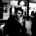
cigarettes advertismentby akyrosComment: Seems more like an anti-cigareet advertisement. Does a good job of creating a negative image around smoking.
It's pretty contrasty ... lights very light, and darks very dark. However if it were less, you'd lose the negative emotion. So I'm not sure I'd change it.
If your camera will support it, I would suggest a larger image. Use the whole 640 pixels. Larger photos are more impactful, their details are easier to see, and the thumbnails seem to work better. |
Home -
Challenges -
Community -
League -
Photos -
Cameras -
Lenses -
Learn -
Help -
Terms of Use -
Privacy -
Top ^
DPChallenge, and website content and design, Copyright © 2001-2025 Challenging Technologies, LLC.
All digital photo copyrights belong to the photographers and may not be used without permission.
Current Server Time: 08/18/2025 05:08:02 PM EDT.