| Image |
Comment |
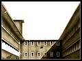
| 09/20/2005 03:12:12 AM |
One Chase Square, Rochester, NYby JPetraliaXComment: Nice composition, but it looks a little over exposed to me, the solid white of the nearest and largest block is a little distracting too. good effort though. |
 Photographer found comment helpful. Photographer found comment helpful. |
| 09/19/2005 10:36:00 AM |
close downby zetosComment: Leally like this image, has a great bleakness about it. |
| Photographer found comment helpful. |
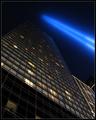
| 09/18/2005 11:32:18 AM |
Raydreamby muur88Comment: I really like this image, reminds me of blade runner or something alond those lines.
It would have been a nice shot without the beams, but they are really fab and add a lot to the image. Hope this does well, good luck! |
| Photographer found comment helpful. |
| 09/18/2005 11:13:53 AM |
|
| Photographer found comment helpful. |
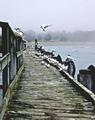
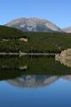
| 09/18/2005 10:47:28 AM |
Birdstopby SteveinnzComment: Nice image. I like the ruggedness of the image, it has a nice starkness too it, enhanced by the colour. Like this a lot, good luck |
| Photographer found comment helpful. |
| 09/17/2005 04:05:35 PM |
Steps towards Eternityby patrinusComment: Great graphic quality to this image, love the diagonals, colour and composition too.
What I would say though, is that it might not do as well as it should because I think people will be looking for a more dramatic perspective, which would be a shame as its a real nice image. Good luck |
| Photographer found comment helpful. |
| 09/17/2005 04:03:14 PM |
Rays of Loveby SDWComment: Great potention here. I really love the detail on the horizon and sky is gorgeous.
I am not so sure about the foreground though, perhaps you could of angled the camera up a little more and got more of that fab sky in and less of the plain grass in the bottom of the image. Reckon its still a good image though, well done! |
| Photographer found comment helpful. |
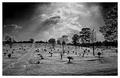
| 09/17/2005 03:59:55 PM |
Split personalityby jimsappComment: Looks like a cracking location but the composition is a little boring in my opinion. It really needs something in the foreground I think. The exposure is nice and the sharpness is great tho. |
| 09/17/2005 03:43:02 PM |
lone fungusby speaseComment: Like the diagonal line of the moss and the placement of the Mushroom is nice too. |
| Photographer found comment helpful. |
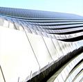
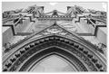
| 09/17/2005 10:27:39 AM |
arcs and lines and all thatby tcmartinComment: Quite a nice architectural shot, but its looks a little light to me, I think the shadows and recesses need to be darker. This would be nitpicking too, but the shot isn't quite symetrical, something a small crop would have sorted out. Tis a nice effort though 5/10 |
| Photographer found comment helpful. |
Home -
Challenges -
Community -
League -
Photos -
Cameras -
Lenses -
Learn -
Help -
Terms of Use -
Privacy -
Top ^
DPChallenge, and website content and design, Copyright © 2001-2025 Challenging Technologies, LLC.
All digital photo copyrights belong to the photographers and may not be used without permission.
Current Server Time: 08/04/2025 03:56:52 AM EDT.