| Image |
Comment |
| 01/13/2007 12:28:28 AM |
Lizby dsa157Comment: Great model, lighting, tones and composition. Excellent job! A more compelling expression would have earned you that last point. 9 |
 Photographer found comment helpful. Photographer found comment helpful. |
| 01/13/2007 12:26:26 AM |
Jessby eris_starComment: Nice composition and model, but full sun will kill you on B&W. Try shooting under the shade of a tree or umbrella or wait for a cloudy day for much softer skin tones and controllable whites. |
| Photographer found comment helpful. |
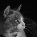
| 01/13/2007 12:23:46 AM |
Rogueby briandsdComment: I suspect that you're probably not very happy with the score on this one, since most voters will be looking for a person in a portrait challenge. You CAN get away with a pet, but only with an exceptional expression and/or lighting. This, I'm afraid, has neither although the focus and composition are pretty good. |
| Photographer found comment helpful. |
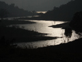
| 01/13/2007 12:19:30 AM |
Rivieraby sanket18Comment: Very pretty, but probably not the portrait the voters are expecting. |
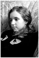
| 01/13/2007 12:15:31 AM |
Imogenby silver_avocadoComment: Great capture, but the processing didn't quite take advantage of its potential. It looks like you had the data available for sharp, contrasty eyes, but you've left them mostly gray and soft. If you have Photoshop available, try this again with the Luko sharpening technique (search the forums). Use Channel Mixer with mostly the green channel to convert to gray, and then dodge the eyes a little in Highlight mode. It should make a HUGE difference. ;-) |
| Photographer found comment helpful. |
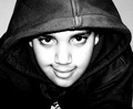
| 01/13/2007 12:08:48 AM |
Heartbreakerby rennieComment: I'm not a big fan of super-high constrast B&W, but your model's great expression bails you out here somewhat. With better lighting, this could be a formidable photo. |
| Photographer found comment helpful. |
| 01/13/2007 12:05:42 AM |
Dinaby chrono_triggerComment: Hmm... looks like you had a great model to work with, but the photo comes up short IMO in a few areas. Most of the values are pure black or white, with relatively few midtones, so it creates a harsh appearance on a model with a soft expression. The centered composition seems static and doesn't direct attention... most viewers will look at the face first and the follow the eyes immediately out of the photo. The graphics on the shirt don't help either. Imagine the same shot with a different shirt, softer lighting (like a big window on an overcast day), and cropped with more room off to the left. THAT would be a good score. As-is, it's about a 5 from me. |
| Photographer found comment helpful. |
| 01/12/2007 11:56:11 PM |
peaceby briantammyComment: I'm not loving the centered composition, but VERY nice expression, tones and focus. |
| Photographer found comment helpful. |
| 01/10/2007 11:09:34 PM |
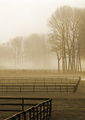
Barriersby scalvertComment: Originally posted by threekiddad:
Very nice; classic misty picture probably in Kentucky |
This cracked me up... I spent all week in Kentucky and thought I might get some good shots of a horse farm on the way home. My hopes were dashed when we left before dawn, so this shot was taken the next day in Connecticut. ;-) |
| 01/10/2007 04:39:42 PM |
Fashion and Fury.by Dan_CottleComment: Awesome. Composition is just a tad too centered for my taste (I have have cropped through the hair at top), but the tones and focus are great. 9 |
Home -
Challenges -
Community -
League -
Photos -
Cameras -
Lenses -
Learn -
Help -
Terms of Use -
Privacy -
Top ^
DPChallenge, and website content and design, Copyright © 2001-2025 Challenging Technologies, LLC.
All digital photo copyrights belong to the photographers and may not be used without permission.
Current Server Time: 08/28/2025 08:07:34 AM EDT.