| Image |
Comment |
| 06/06/2004 08:52:04 PM |
Incensesby bormicComment: Cool smoke and nice DOF. The burning areas look dull for some reason, like the red channel was desaturated. The composition is kind of scattered with no obvious focal point- if the sticks were on a diagonal, it might form a nice path for your eye to follow. |
 Photographer found comment helpful. Photographer found comment helpful. |
| 06/06/2004 08:46:00 PM |
|
| 06/06/2004 08:42:51 PM |
Around we goby jmritzComment: Good idea and composition. Looks like the opposite side of the carousel might have offered more light . |
| Photographer found comment helpful. |
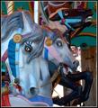
| 06/06/2004 08:39:16 PM |
Escutcheonsby GeneralEComment: Confusing. The top is overexposed and the centered floodlight becomes a major element here. Looks like you cropped a lot to get to this point- was there any more at the bottom that would allow you to center the shields? |
| Photographer found comment helpful. |
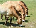
| 06/06/2004 08:35:27 PM |
Przewalskis Horseby jackditchComment: Nice alignment. A little hot on the left side. A vertical crop of just the heads would avoid the hot areas and create a nice diagonal that emphasizes that alignment. |
| Photographer found comment helpful. |
| 06/06/2004 08:32:55 PM |
|
| 06/05/2004 12:04:38 AM |
Three fingersby tmb1070Comment: ...or 6 or 10 (one hand would have been better). The shot itself is great, but my focus is squarely on that dramatic red color rather than the threes. |
| Photographer found comment helpful. |
| 06/04/2004 11:56:06 PM |
On My Honor...by soccerdadComment: Not sure you needed the medal- the title is plenty, and the color of the medal draws attention away from the three fingers. I know you were adding interest, but the medal floating in space just seems like an awkward disconnect to me. Perfect color & focus, though. |
| Photographer found comment helpful. |
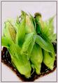
| 06/04/2004 11:52:29 PM |
"All Ears"by tfarrell23Comment: Great color and focus on the corn. I wish the background were a dark, contrasty color for more punch. |
| Photographer found comment helpful. |
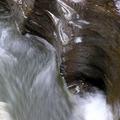
| 06/04/2004 11:43:10 PM |
Untitledby andywightmanComment: Assuming that your intention is to show the 3 shape formed by the rock? I think that's going to be too subtle for the bulk of voters, though i like the composition and movement you've captured. |
| Photographer found comment helpful. |
Home -
Challenges -
Community -
League -
Photos -
Cameras -
Lenses -
Learn -
Help -
Terms of Use -
Privacy -
Top ^
DPChallenge, and website content and design, Copyright © 2001-2025 Challenging Technologies, LLC.
All digital photo copyrights belong to the photographers and may not be used without permission.
Current Server Time: 08/25/2025 11:46:03 PM EDT.