| Image |
Comment |
| 02/19/2004 12:52:50 PM |
|
 Photographer found comment helpful. Photographer found comment helpful. |
| 02/19/2004 12:50:06 PM |
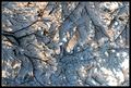
Harmonyby RoosterComment: Picture is too dark for me. I would want to see the texture of the sculpture brought out more. |
| Photographer found comment helpful. |
| 02/19/2004 12:48:20 PM |
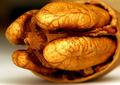
Fleshyby jab119Comment: Great lighting! I like the deception of the eye to what exactly it is. (Thumbnail size) |
| Photographer found comment helpful. |
| 02/19/2004 12:45:57 PM |
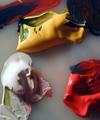
Ouch!by chimeraComment: Would have centered this a bit more or got rid of the blue thing in the B/R corner. IMy eye finds the blue distracting. |
| Photographer found comment helpful. |
| 02/19/2004 12:44:17 PM |
Paintby valborgComment: Like the concept of photo. bit too much negative space for me |
| Photographer found comment helpful. |
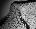
| 02/19/2004 12:42:46 PM |
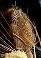
Starfishby ladpupmoeComment: Like the texture shown. Lighting, to me, is a little off. Doesn't sem to carry my eye down the arm |
| Photographer found comment helpful. |
| 02/09/2004 01:50:25 PM |
|
| Photographer found comment helpful. |
| 02/09/2004 01:47:33 PM |
|
Home -
Challenges -
Community -
League -
Photos -
Cameras -
Lenses -
Learn -
Help -
Terms of Use -
Privacy -
Top ^
DPChallenge, and website content and design, Copyright © 2001-2025 Challenging Technologies, LLC.
All digital photo copyrights belong to the photographers and may not be used without permission.
Current Server Time: 08/04/2025 10:19:51 AM EDT.