| Image |
Comment |
| 02/24/2008 08:39:12 AM |
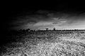
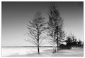
Fields (Week 2)by booboo_goonComment: Hmmm a little one sided for me and think I'd have preferred this cropped to just as the dark areas became lighter and lose a fair amount of the foreground. Some dodging and burning of the sky would make this more dramatic I think. |
 Photographer found comment helpful. Photographer found comment helpful. |
| 02/24/2008 08:35:11 AM |
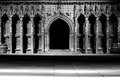
Lincoln cathedral (Week 1)by booboo_goonComment: I agree with the earlier commenters and feel the image takes on a different dimention when losing the 2 white line sin the foreground. I'd be interested in your shot settings (hint for further submissions) as viewing them help me almost as much as the shot itself! |
| Photographer found comment helpful. |
| 02/24/2008 08:30:58 AM |
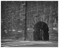
Three Miceby pawdrixComment: hehe great title for a nice spot! (three mice by 'paw'drix lol). Great detail on the wall, I'd have preferred the wall to be straighter though. A simple though thought provoking shot :) |
| Photographer found comment helpful. |
| 02/24/2008 08:24:53 AM |
Week 3 - Hannahby CapeSailComment: I'm learning about fixed/flash lighting as well and have so far found that a great setup for one pose doesn't work for a slightly different one so there is no magic setup - I think you got it just about right and as has been said the shadows are soft and add to the shot rather than detract imho.
Am not a fan of the totally black hat and coat but agree it does frame her face well. I doubt Hannah is a fan of her freckles but I'd have liked them a little more prominent.
Great shot btw :) |
| Photographer found comment helpful. |
| 02/24/2008 08:11:07 AM |
03 Caitlinby SandyPComment: Dang! another week gows by when I can't write a small list of things that niggle me! Technically its almost perfect (composition/lighting/exposure/BW range are all spot on).
I do keep getting drawn to the wall in the left third of the picture and wonder if a brick or plastered wall would improve the image or detract from the subject - Caitlin. |
| Photographer found comment helpful. |
| 02/24/2008 08:03:50 AM |
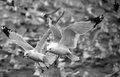
03 - Pair of Seagullsby ErikVComment: Totally agree with the other commenters, well done seperating this pair of gulls from the flock! I've tried it and it isn't as simple as it may appear. Would be interested to know if you had to crop this much for the excellent composition? |
| Photographer found comment helpful. |
| 02/24/2008 07:50:36 AM |
the lookoutby RetroesqueComment: Great candid shot and you are spot on with the 'shoot now' method, this shot could tell so many stories. The stark contrast and harsh lighting seems to add to the 'tention' in this shot :) hope you didn't go down there alone! |
| Photographer found comment helpful. |
| 02/24/2008 07:46:31 AM |
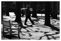
300_0257-wk-6.jpgby salmiakkiComment: Very nice shot and editing :) as was mentioned earlier I think the scene might have looked better with the trees further to the right but maybe you composed like this to show the lone person? |
| Photographer found comment helpful. |
| 02/24/2008 07:42:58 AM |
Tobyby doc_gonzoComment: Really like the fact that you got down to Toby's level for this though would have preferred him to be fully in focus. |
| Photographer found comment helpful. |
| 02/22/2008 04:28:32 PM |
6.52 Nice dayby MelethiaComment: Difficult one this after seeing both edits. Hows about using the man from the reedit in this shot? Very bold shadows and I'd probably have put my cam away in this light (so, now I know not to lol) |
| Photographer found comment helpful. |
Home -
Challenges -
Community -
League -
Photos -
Cameras -
Lenses -
Learn -
Help -
Terms of Use -
Privacy -
Top ^
DPChallenge, and website content and design, Copyright © 2001-2025 Challenging Technologies, LLC.
All digital photo copyrights belong to the photographers and may not be used without permission.
Current Server Time: 08/01/2025 07:03:34 PM EDT.