| Image |
Comment |
| 01/20/2003 10:53:09 PM |
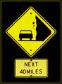
Falling Rocks - Floating Signby DigitalGravyComment: Ok, this is one of very few photos where the border really adds to the photo - well done. I'm glad you chose a thin yellow line and didn't over do it. The floating effect is also quite nice - it's a simple elegant photo. Framing is also nicely balanced. |
 Photographer found comment helpful. Photographer found comment helpful. |
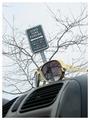
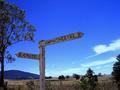
| 01/20/2003 10:50:22 PM |
Over The Hill Estates for those in the state of being Over The Hillby LindaEComment: I like the photo, but it's slightly distracting that the bottom edge of the sign is cropped out. In fact, I think you could have probably included at least half of the mand and really brought him into the photo. His facial expression is quite good, as are exposure, colour and focus. |
| 01/20/2003 10:48:06 PM |
|
| 01/20/2003 10:45:44 PM |
Nailedby jmsetzlerComment: That's a very aggressive crop, but it works fairly well. The biggest distraction I have is the yellow line running slightly diagonally down the sign. I susect it might be glare of some sort, although the shadow on the nail indicates the sun is hard right. Focus is good, as is the title - well done. |
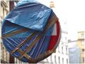
| 01/20/2003 10:43:21 PM |
lollipopby miss parkerComment: I like the shallow depth of field - it brings attention to the sign. I think you may have cropped it a little too tightly though, especially at the top. With the shallow depth of field I would have tried to include a bit more background - it wouldn't have distracted the viewer much. Also, since you chose a new sign (still wrapped up) I was expecting something in the title to reflect that fact, like "brand new lollipop" or "coming to a street near you soon". The focus and exposure win good points though. |
| Photographer found comment helpful. |
| 01/20/2003 10:40:32 PM |
Ironic Intersectionby Ricky CleaveComment: Nice composition. I'm curious as to why you chose such a bright border around a fairly dark image. The focus is very crisp, which makes the writing easy to read and the balance of the signs is good. |
| 01/20/2003 10:35:16 PM |
International Roadsignby David EyComment: Nice composition. The whiteness of the cross, and redness of the flowers, in an otherwise muted background is very effective - they certainly draw your attention. Exposure and focus are also good - not quite brilliant, but certainly good enough. And your title - well, yes it is international. Well done. |
| Photographer found comment helpful. |
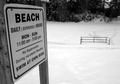
| 01/20/2003 10:17:34 PM |
Pass on the Chili Dip (pun)by BullwinkleComment: Nice perspective on the sign - it helps show the "inclement weather" in the area. Was the photo really more effective in black and white than colour? I guess it adds to the coldness aspect somewhat. Focus is very good and the image is quite easy to look at. |
| 01/20/2003 09:42:18 PM |
Sign in Blueby PtmanComment: Nice photo = the sign is framed by the tree very well, plus the outback location is obvious. |
| 01/20/2003 09:40:33 PM |
Through a Kids Eyes.by vtruanComment: Composition is very good and colour is vibrant. The lighting looks a little bit harsh though - was it done with a flash perhaps? |
| Photographer found comment helpful. |
Home -
Challenges -
Community -
League -
Photos -
Cameras -
Lenses -
Learn -
Help -
Terms of Use -
Privacy -
Top ^
DPChallenge, and website content and design, Copyright © 2001-2025 Challenging Technologies, LLC.
All digital photo copyrights belong to the photographers and may not be used without permission.
Current Server Time: 08/14/2025 08:38:04 AM EDT.