| Author | Thread |
|
|
01/31/2003 08:25:18 AM |
Greetings from the Critique Club :)
Hi Miss Parker :)
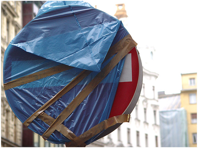
I see some occasional signs like this in my own community. They are usually wrapped up like this when they are new and not actually in use yet. The city road crew usually does this to alert the drivers that there is a new sign coming and to make people aware of it before it actually comes into use.
I like your choice of a shallow depth of field on this photo in order to help isloate your subject against the background. I only see one comment in your comments that suggests more depth of field, and I heartily diasgree with that.
To improve the overall impact of this photo, I believe that showing a little more of the sign post would have been a good idea. Your "lollipop" concept may be slightly weakened by not having more of the 'stick' visible :)
The 717 is a great camera... Keep up the good work!
John Setzler
|
|
 Photographer found comment helpful. Photographer found comment helpful. |
Comments Made During the Challenge  |
|
|
01/26/2003 09:42:15 PM |
|
Better get that wrapper off quick and start sucking ;) jgillard7 |
|
|
|
01/24/2003 07:17:07 AM |
|
Though the background is not very interesting I like the idea of showing what the sign is not yet prohibiting entry into. Good idea. |
|
| Photographer found comment helpful. |
|
|
01/23/2003 11:47:54 AM |
|
Nice framing of subject, soft focus of background dosen't distract, while the lines seem to draw me in. Nicely done. |
|
| Photographer found comment helpful. |
|
|
01/22/2003 11:20:00 PM |
|
okay, nothing special stands out |
|
|
|
01/22/2003 08:49:03 AM |
|
Is that a lollipop wrapper? :-) |
|
|
|
01/21/2003 07:50:11 AM |
|
|
|
01/21/2003 06:48:26 AM |
|
|
|
01/20/2003 10:43:21 PM |
|
I like the shallow depth of field - it brings attention to the sign. I think you may have cropped it a little too tightly though, especially at the top. With the shallow depth of field I would have tried to include a bit more background - it wouldn't have distracted the viewer much. Also, since you chose a new sign (still wrapped up) I was expecting something in the title to reflect that fact, like "brand new lollipop" or "coming to a street near you soon". The focus and exposure win good points though. |
|
| Photographer found comment helpful. |
|
|
01/20/2003 07:08:40 PM |
|
heehee, great find..good eye. |
|
|
|
01/20/2003 10:50:14 AM |
|
my shots like this the background was over exposed too. not sure what i needed to do to fix that. |
|
|
|
01/20/2003 02:50:07 AM |
|
Harsh light to the right! More DOF would have improved it... Cub |
|
|
|
01/20/2003 01:15:52 AM |
|
Great, you've got the song stuck in my head. Hm. The right side seems a bit washed out and/or overexposed. And to get the "lollipop" concept across, you might have included some of the pole (stick). |
|
| Photographer found comment helpful. |
Home -
Challenges -
Community -
League -
Photos -
Cameras -
Lenses -
Learn -
Help -
Terms of Use -
Privacy -
Top ^
DPChallenge, and website content and design, Copyright © 2001-2026 Challenging Technologies, LLC.
All digital photo copyrights belong to the photographers and may not be used without permission.
Current Server Time: 06/28/2026 08:56:03 PM EDT.