| Image |
Comment |
| 01/23/2003 11:25:01 PM |
.....road side siloby undieyatchComment: Ok, I recognise the link to the other challenge but I don't think that should really count towards votes much so I'll ignore it. Composition is fairly good, focus is quite good but the photo really isn't interesting. |
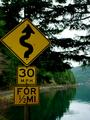
| 01/23/2003 11:19:02 PM |
Curves Aheadby KathycComment: This image is fairly good but it just doesn't grab my attention. Composition is fairly good, although perhaps cropped a little too tight on the left edge. I wonder if there was someway of including the windy road - as hinted by the sign. Also the image is perhaps a little too dark - but only by a fraction. |
| 01/23/2003 11:08:08 PM |
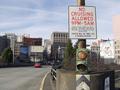
pay attentionby MagsCoyoteComment: This photo looks a little over exposed - the black isn't very black and the red looks washed out. Also having part of each work hidden is a little uncomfortable. Perhaps you were trying to create the illusion that you weren't stopping (ie: were moving past the sign) however this thought didn't occur to me for quite a long time (ie: several viewings) so it's not obvious. |
| 01/23/2003 11:05:30 PM |
Head Gamesby jitamsComment: It looks like some tag team photography going on here - congrats. That also looks like a good camera in his hands. I love the humour of the sign in this shot - very dry. Composition is pretty good however the top edge is a little uncomfortable - difficult to crop with the top of the sign crooked. I wonder if rotating the image to crop along the sign edge would have worked or looked silly. |
 Photographer found comment helpful. Photographer found comment helpful. |
| 01/23/2003 11:02:47 PM |
Twilight Sculptureby MrsTurboComment: I think the sign is placed a little too far to the edge of the picture - it's supposed to be the theme this week. The focus on the sign also seems to be a little bit off. |
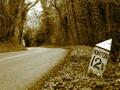
| 01/23/2003 10:40:23 PM |
Are We Nearly There Yet?by ioComment: Nice composition and colour. The image is perhaps a little too soft for my preference although I'm not sure whether sharpening it might help or hinder. The mile marker is well positioned in the frame and I love the way the road disappears - it makes me want to know where it goes. |
| Photographer found comment helpful. |
| 01/23/2003 10:27:41 PM |
Highway 314by vjozComment: I like the colouring however the white snow (?) on the road is a little too bright - perhaps try toning this down a little. Composition is good - especially the perspective on the sign. |
| Photographer found comment helpful. |
| 01/23/2003 10:17:27 PM |
|
| 01/23/2003 10:16:03 PM |
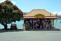
WEIGHBRIDGE........old roadsign in akaroa NZby HoogieComment: As a roadsign it doesn't interest me, however I find the mini parked under the tree kind of cute - with some creative editing that could become a cool photo. Technically though your photo is ok - composition is good, the image is perhaps a little overexposed or too bright though. |
| 01/23/2003 10:13:31 PM |
|
| Photographer found comment helpful. |
Home -
Challenges -
Community -
League -
Photos -
Cameras -
Lenses -
Learn -
Help -
Terms of Use -
Privacy -
Top ^
DPChallenge, and website content and design, Copyright © 2001-2025 Challenging Technologies, LLC.
All digital photo copyrights belong to the photographers and may not be used without permission.
Current Server Time: 08/14/2025 10:42:40 PM EDT.