| Image |
Comment |
| 02/10/2003 09:33:26 PM |
He Went Thataway!by GeneralEComment: I don't think you hid the person well enough! I would have cropped the left edge, and moved the finger in appropriately. Also, it looks like you have a lot of dust / hair on the lens of your camera (or are these scratches in the board). Unfortunately I really don't think this meets the challenge and I don't understand the significance of the maze / title. |
| 02/10/2003 09:30:34 PM |
Empty promenade by miracComment: Nice shot. It is very moody in black and white. I'm 99% certain I can see the person - subtle yet also nicely centred. I like the way the road leads you into the photo, whilst the building and nearest light pole provide points of interest. Well done. |
 Photographer found comment helpful. Photographer found comment helpful. |
| 02/10/2003 09:27:51 PM |
Where is Cindy?by Dim7Comment: It looks like Cindy fell over. I like the composition, and the colour & exposure are pretty good. |
| Photographer found comment helpful. |
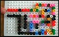
| 02/10/2003 09:26:31 PM |
Waldo´s Stuffed Animalsby MonaComment: Ok, you almost beat me. I had given up and then spotted the forehead at the last minute - well done in that respect. The magazines on the left are distracting, and the plant is a little distracting as well. Lighting is ok, but perhaps a little fill from the left might have balanced things out. The border compliments the couch well. |
| Photographer found comment helpful. |
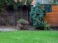
| 02/10/2003 09:23:06 PM |
Intruder Alertby auroraComment: You have hid the person well (is that a real person or a print). Colour and focus are fine, although the image isn't real exciting in any way. |
| 02/10/2003 08:34:36 PM |
Friendsby myqylComment: Good work - you've met the challenge and provided a reasonably interesting photo. Focus is fine, as is exposure. I might have tried for some more colourful toys, if available. |
| Photographer found comment helpful. |
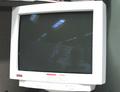
| 02/10/2003 08:31:13 PM |
Virtual Waldo!!!by robconComment: Yet another case of "you've met the challenge but it's not a terribly interesting photo." Technically the focus looks a little soft - Compaq and Digital are very hard to read. Composition wise the shelf in the top edge of the photo is a shame, but the big distraction are the reflected fluoro lights. My suggestion would have been to tilt the monitor down to remove the lights. |
| Photographer found comment helpful. |
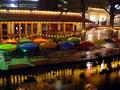
| 02/10/2003 08:17:26 PM |
Empty Stadiumby AmieeComment: To be honest, this is a fairly boring photo. It might meet the challenge but it doesn't offer anything interesting to look at. Perhaps a different perspective of the stands could have made for a more interesting photo. Technically it's not bad - very grey and looks like you didn't have a lot of light available. Focus is ok, the powerpole is a little distracting |
| 02/10/2003 08:13:31 PM |
Spy Kittiezby magnetic9999Comment: I like this - its kind of funny, and actually took me a couple of seconds to realise the cutouts were real and not photoshopped in (once the calendar loaded). |
| Photographer found comment helpful. |
| 02/10/2003 08:09:41 PM |
It's All Just a Blur Now...by kretsComment: I actually found the person before reading your title, but the title was a good hint. I might have cropped the top of the image a little more. The yellowish lights are nice, but the blueish lights in the top-left are a bit stark. Other than that you have done well - nice focus and exposure. Good work. |
| Photographer found comment helpful. |
Home -
Challenges -
Community -
League -
Photos -
Cameras -
Lenses -
Learn -
Help -
Terms of Use -
Privacy -
Top ^
DPChallenge, and website content and design, Copyright © 2001-2025 Challenging Technologies, LLC.
All digital photo copyrights belong to the photographers and may not be used without permission.
Current Server Time: 08/14/2025 05:51:33 PM EDT.