| Image |
Comment |
| 01/20/2003 07:39:05 PM |
Duck Crossingby Wheeler1992Comment: You get points for humour although it looks like the photo needs to be rotated clockwise slightly (to make the sign and building point straight upwards). Focus and exposure are quite good - especially since it looks like the light levels weren't very good. |
 Photographer found comment helpful. Photographer found comment helpful. |
| 01/20/2003 07:37:20 PM |
a very quite caravan parkby bayuComment: The red trees and road look really nice - really moody. I hope you took a shot of just that tree (without the sign) - it looks like a real good candidate for a photo. |
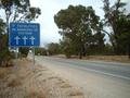
| 01/20/2003 07:34:29 PM |
Paved with good intentions.by RuchartComment: Perspective and framing is very good. The trees in the background are good. As a suggestion I would have rotated the image slightly - either have the bottom of the sign exactly horizontal of the arrow exactly horizontal, but it still looks good as it is now anyway. PS: A bonus point for finding a sign that says "Hell ->" |
| Photographer found comment helpful. |
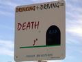
| 01/20/2003 07:31:13 PM |
You do the Math...by terik65Comment: The sign is a tad underexposed. It looks like the sun was behind the sign - I had to revisit my sign in the morning to get around this. Framing is interesting and works ok - there's just a fraction of something creeping into the bottom left of the image, but that's not a big distraction. Your title is very good. |
| Photographer found comment helpful. |
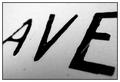
| 01/20/2003 07:29:20 PM |
Avenueby mciComment: Well done on submitting a macro shot to the challenge. The shallow depth of field works well (blurring both the A and E evenly). The border is ok and the photo actually has some interest to it - I keep looking at it. Good work. |
| Photographer found comment helpful. |
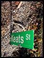
| 01/20/2003 07:27:17 PM |
Keats St.by jimmythefishComment: Aarggh - this photo makes me dizzy. My brain tells me that I'm looking straight down (or even titled further than "straight" down). I presume the sign is sticking out of the ground for some reason. Technically a good photo, but I'm not sure about it's message - what is it trying to say? |
| Photographer found comment helpful. |
| 01/20/2003 07:25:13 PM |
Street Signby STEINRComment: Even though the sign is huge I'm not drawn to it - there's a lot happening in this photo and it's difficult to understand the main subject. In some ways it's a nice collection of lots of types of signs, although you title suggests a single sign is the intended focal point. |
| Photographer found comment helpful. |
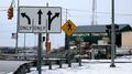
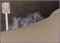
| 01/20/2003 07:23:22 PM |
Parking - 30 Minutes Onlyby mcraelComment: I'm not usually a fan of infrared type photo's but I guess in this case the photo would have been quite boring in normal colour. Focus is good and the trees add interest. Is the sign deliberately crooked in the photo? |
| Photographer found comment helpful. |
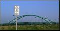
| 01/20/2003 07:20:48 PM |
No Cars Allowedby GeneralEComment: Technically the photo is fairly good - composition, colour, focus, etc. Unfortunately it's not a very exciting photo. Perhaps you could have got a photo of some cyclists on the path or something? |
| 01/20/2003 07:17:43 PM |
Will you be next?by Delta_6Comment: Nice composition. The trees are a little blurry, but I suspect this might be from a long exposure and wind combined - not much you can do about that. Perhaps a clearer sky would be nicer, but it's not a big deal. Colour is nice and realistic |
| Photographer found comment helpful. |
Home -
Challenges -
Community -
League -
Photos -
Cameras -
Lenses -
Learn -
Help -
Terms of Use -
Privacy -
Top ^
DPChallenge, and website content and design, Copyright © 2001-2025 Challenging Technologies, LLC.
All digital photo copyrights belong to the photographers and may not be used without permission.
Current Server Time: 08/13/2025 02:35:33 PM EDT.