| Image |
Comment |
| 11/16/2004 11:53:24 AM |
Something sweet, anyone?by docpjvComment: Nicely composed. I would have lost the bottom part of the image and upped the contrast a little. Their is a definate "flatness".
The highlights along the bottom edge detract fom the highlights on the fruit itself.
Still nice though |
 Photographer found comment helpful. Photographer found comment helpful. |
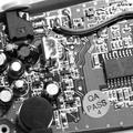
| 11/16/2004 11:46:07 AM |
Circuitry Cityby JCDeanComment: Good histogram spread from pure black through to pure ehite.
One thing I think would have improved the balance would be to have cropped top and bottom. That would have chopped out the small white wedges top left - bottom right |
| Photographer found comment helpful. |
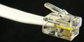
| 11/16/2004 07:03:52 AM |
Phoneless Cordby whatdewucComment: A brilliant example of where the title and the picture are one.
I earlier grumblued at one entry re their titling explaining how their title competed with their picture. This though is brilliant. It would make a great poster with the text as part of that. |
| Photographer found comment helpful. |
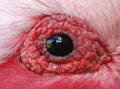
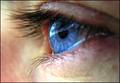
| 11/16/2004 06:58:19 AM |
I can see you baby!by StagoleeComment: This may seem a hard crit of a potentially great picture.
- spoiled by the reflection. It looks like the photographer at a window (I assume thats what it is). The title only seems to explain away an accidental image caught in the eye.
If you can imagine this hung on a wall as it is and then hung on a wall with black eye plus a catchlight I think you would see what I mean.
It may be that it was impossible to get the shot without the reflection, in which case - well done.
If I was still judging it would have to go in the "nearly pile" which is a great shame. Of course to hang it on a wall would be easy after some simple PS editing (I know you can't for this challenge" so I will mark it as I would have done without the reflection.
|
| Photographer found comment helpful. |
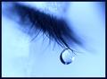
| 11/16/2004 06:49:59 AM |
Tear Drop Blues by kosmikkreeperComment: What can I say. If I was still judging for publications this would certainly go "next round".
A shame about the dark area "top right" fantastic DOF and stunning catchlight. I am ignoring the crazing top centre dribbling down which I suspect looks softer in the original and put down to compression.
Love it |
| Photographer found comment helpful. |
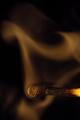
| 11/16/2004 06:35:37 AM |
After the Fireby hyperfocalComment: As each picture comes on the screen I force my first thought to be "would I want it to hang on my wall" second thought "Would I use it commercially" third thought "would I pay money to have a print" fourth "is it technically correct" (the fourth does not matter if 1,2 and 3 are met)
This makes a yes in all 4.
Excellent. |
| Photographer found comment helpful. |
| 11/16/2004 06:31:46 AM |
|
| 11/16/2004 06:28:55 AM |
Yummmby BigZenDragonComment: Nearly a brilliant ad shot and one I would certainly have put in the "next round" pile but to be used commercially it would need a much longer depth of field. It may be that you not have the equipment to achieve that, in which case exellent on what you did achieve.
A picture that I would have framed if it was reshot exactly as it is but with different lighting, DOF |
| Photographer found comment helpful. |
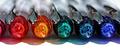
| 11/16/2004 05:44:34 AM |
Spectrumby annasenseComment: Great - rich colours - the hi-lights, reflections are all perfectly aligned - lovely detail on the inside top of the pens.
From a photographic point of view it is excellent - exposure spot on. Depth of field just right - point of focus, exact.
For a competition I would definately put in on the list.
As a picture on my wall I cannot say it would get space but that is not the point here. I will definately be looking at some of your other work. |
| Photographer found comment helpful. |
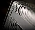
| 11/16/2004 05:38:31 AM |
ventby jus6681Comment: Good - well lit - space for advertising - good example of depth of field - maybe focus point could have been more off centre. If I was still shooting this type of item in a studio for magazine use I would have put matt black tape/card over whatever it is putting that light "smudge" near the top right |
Home -
Challenges -
Community -
League -
Photos -
Cameras -
Lenses -
Learn -
Help -
Terms of Use -
Privacy -
Top ^
DPChallenge, and website content and design, Copyright © 2001-2026 Challenging Technologies, LLC.
All digital photo copyrights belong to the photographers and may not be used without permission.
Current Server Time: 06/28/2026 07:03:09 AM EDT.