| Image |
Comment |
| 02/10/2004 09:21:22 PM |
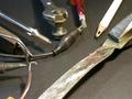
Me, Myself, and Iby leafComment: allright, well just in case anyone else stops in here and was wondering what i was trying to do.. i will explain myself.
the image is of me holding the key, the shadow of me holding the key and the reflection.. i cropped it tight so just the key is left.. and obviously i cropped it TOO much.. so that most peopel could not tell what i was doing. I liked that i was able to capture a relection as well as a shadow, and presented all three keys and me in a abstract, stylistic way. |
| 02/07/2004 11:43:47 AM |
Tools purposes.by gwsallenComment: Due to the vary dark shadows, it appears as though there is one primary light souce. This makes this image very contrasty (too contrasty) making the highlights burned out, and little detail in the darks. The pencil on the top is way too light.. .it grabs my eye for all the aattention then has nothing in it for detail to keep it there. It is an interesting concept to have all the tools interacting with eachtoher.. but perhaps a little busy. Maybe it would be interesting to have just one interaction.. oh hhh all except the pencil.. it isn't interacting at all. Good start. keep up the good work. |
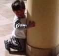
| 02/07/2004 11:40:37 AM |
Where is my Daddy?by litosantiagoComment: The image seems very soft / out of focus. The whites on the back of the boy's shirt are burnt out. I like the formal elements of the image, but they are weekend by a few things. The boys head is cropped RIGHT where it meets the top of the image. This is a no no and creates tension and makes my eye leave the picture. It should be cropped (IMO) either further down or farther up. From the angle you took it, it would be hard to get the pillar vertical and the boy still looking natural but i think it would be worth a try. I KNOW pillars are vertical.. and it 'doest really work' to have them on a 'slight' slant ... but good eye for something interesting..and good luck further. I DID like the image, despite the problems i had with it.. and remember these are just MY thoughts... not everyones. |
| 02/07/2004 11:31:08 AM |
Brick and Oreby puyaComment: I had this image lower and i have been bumping it up a few socres. I really like the lines, flow and simplicity of this. Perhas it is cropped a bit too tight on the left creating tension... either more or less but not RIGHT ON the edge... Good exposure. Well actually.. i am not sure i see any REAL blacks... they seem just ALMOST black to me... in addition to the bricks looking like they could have a little more depth (being a little darker would do this).. but i reall liked it... great image... almost perfect. |
 Photographer found comment helpful. Photographer found comment helpful. |
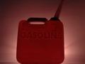
| 02/06/2004 06:57:56 PM |
::RED HOT::by DsealeComment: The gas can seems out of focus which is distracting to me. The tip of the can is also 'just' cut off which creates a bit of dificulty for me. My eye starts at the can, then goes to the spout.. and leaves the picture... it doens't make me want to look at the picture. Interesting lighting (from behind) which creates an interesting glow,.. perhaps the can also looks very heavyand too grouded being cropped RIGHT on the bottom of the image. Either heigher up or lower down.. but not RIGHT on the bottom. |
| Photographer found comment helpful. |
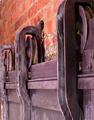
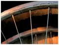
| 02/06/2004 06:55:53 PM |
Time to retireby geewhyComment: great colors and interest. I like the dirt on the wall and the wheel's and the warm lighting. A great simple piece, with enough given to let us know what it is and finish the picture with our heads. good job. |
| Photographer found comment helpful. |
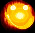
| 02/06/2004 06:54:28 PM |
My Flashlight Smiley - (at least it's funny)by oskarComment: I think this image is too cliche for me to find very interesting. The image additionally seemsquite burned out on the whites. The yellow color you achieved is a very bright exciting color, but perhaps is distracting with the red and burnt white. I also find the wood grain behind the image distracting. Perhaps if this image had been taken on a white wall it would have worked better.
hope some of this helped.
keep up the good work... from the critique club. |
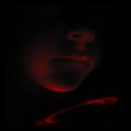
| 02/06/2004 06:49:20 PM |
A Square Jawby GeneralEComment: I like the tone and mood of this image. It makes me think and wonder. It is a very dark image, and i know it is meant to be... perhaps i would say it was well exposed, i guess you don't have a bright light source.. and it looks like on the boy's chin the red is almost blasting out,... so perhaps it is fine... I think the cropping of the image was done well.
Perhaps The picture is too contrasty. Perhaps somelight should be given to the entire image... and let it still be dark, but not SO dark. an image can be low key with good detail. This makes an image more interesting generally than an image that is too dark to see anything.
overall, good, just play with the lighting a bit more.
-from the critique club-
and remember, these are just my thoughts. |
| Photographer found comment helpful. |
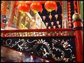
| 02/06/2004 06:45:00 PM |
Enter The Dragonby ImagineerComment: This is a very busy photogrpah with lots going on and lots of colors to catch my attention. i think it helps very much and works well with the repetition found in the image. the three large orange lanters, the lanters in the background, the cut out's on the railing. I think all of these are important. The image seems a little washed out in the brigh whites, on the building in the back and on the speakers... and the blacks don't seem quite black. perhaps it is 1/2 stop too light. I think the two speakers on the right are a bit distracting. They are a very odd shape (compared to the rest of the picture) and odd color, and if it were me i would crop them out. Interesting colors, and a very active shot.
hope this helped, and remember it is only my opinion.
- from the critique club - |
| Photographer found comment helpful. |
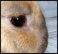
| 02/05/2004 01:07:34 AM |
Just My Rabbit ,Characteristic: Very Nice,Forbearingby MonaComment: hei from the critique club
the image is very sharp and has a good tonal range with good darks, lights and middle tones. The white is on the verge of dissapearing but is still hanging in there. On the background to the right there are some lines i find distracting. Perhaps if you used a smooth background you could get rid of this. The placement of the eye was well executed, and is in an attractive spot, perhaps this picture suffers from poor lighting.. perhaps that is being a bit hypocritical to what i said before about tones... but there seems to be a main light source from the left which is blowing out the hair on the left, making a glare in the eye, and making akwardly lit subject. Perhaps if you used a difused light source on the other side, or repositioned your light source that would help. The image is almost abstract in nature, which could work effectivly, but something still seems to be missing. I am not sure what. perhaps play with including more of the rabit, or closer or different lighting. hope some of these sudjestions helped...
and remember.. it is only my opinion |
| Photographer found comment helpful. |
Home -
Challenges -
Community -
League -
Photos -
Cameras -
Lenses -
Learn -
Help -
Terms of Use -
Privacy -
Top ^
DPChallenge, and website content and design, Copyright © 2001-2025 Challenging Technologies, LLC.
All digital photo copyrights belong to the photographers and may not be used without permission.
Current Server Time: 08/26/2025 02:08:00 AM EDT.