| Image |
Comment |
| 05/05/2005 08:07:55 AM |
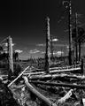
Depressionby ArtifactsComment: nice landscape. Good use of contrast. reminds me of treeplanting. |
 Photographer found comment helpful. Photographer found comment helpful. |
| 05/05/2005 08:07:34 AM |
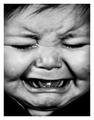
@#%&$!!!by grigrigirlComment: fun image, poor kid :) perhaps a touch too much contrast. but nice |
| Photographer found comment helpful. |
| 05/05/2005 08:06:32 AM |
|
| Photographer found comment helpful. |
| 05/05/2005 08:06:20 AM |
|
| Photographer found comment helpful. |
| 05/05/2005 08:06:06 AM |
|
| Photographer found comment helpful. |
| 04/26/2005 10:17:54 AM |
|
| Photographer found comment helpful. |
| 03/02/2005 03:00:18 AM |
plush by jus6681Comment: congrats on a great image.
This one, by far, stood out from all the other images for me. Great image, and I am glad i ribboned. |
| 02/09/2005 04:14:48 AM |
Pulling Hairby Nikolai1024Comment: :) this one made me laugh... cause i know the feeling.... it has a great feeling of tension. |
| Photographer found comment helpful. |
| 01/24/2005 05:14:13 AM |
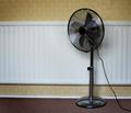
Rad / Fanby redmoonComment: i don't know why no one else has picked this as a fav....
i think i could almost be tempted to buy a print of it.... |
| 01/19/2005 06:05:25 PM |
American Psychoby rmtm333Comment: allright, i'll leave you a comment, although i didn't vote..
the lighting is very harsh.. I realize you wanted a strong lighting from one direction, but it looks like you used an open bulb, where light leaked all aroudn the image, creating one hot spot and lots of bland grey with not much detail otherwise. the image looks slightly soft which could be from the long shutter speed. Good use of framing, but i think i would like it a bit better with more space around the head... black above the head for example.
I think it is mostly the light though.. i am not sure why lamps give this sort of unflattering 'non professional' look, but they do. (if it is not a lamp then i am in the wrong).. but a light which has a direction flaps, or a good metal shade around it create a much different light, or a flash does the same thing.... good use of shadows and idea however, and good use of negative space..keep it up.. |
| Photographer found comment helpful. |
Home -
Challenges -
Community -
League -
Photos -
Cameras -
Lenses -
Learn -
Help -
Terms of Use -
Privacy -
Top ^
DPChallenge, and website content and design, Copyright © 2001-2025 Challenging Technologies, LLC.
All digital photo copyrights belong to the photographers and may not be used without permission.
Current Server Time: 08/26/2025 06:46:57 PM EDT.