| Author | Thread |
|
|
01/24/2005 03:32:51 AM |
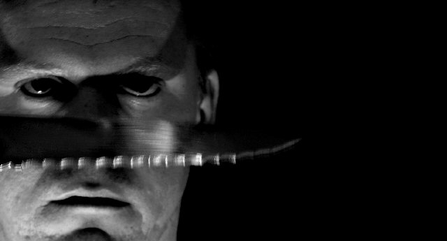
Well you did a whole heap better than me in this challenge. I think a greater emphasis on the knife, and a vertical format might have been better,. now what did I do wrong with mine.?
Message edited by author 2005-01-24 03:35:31. |
|
 Photographer found comment helpful. Photographer found comment helpful. |
|
|
01/20/2005 11:00:08 AM |
|
I did not vote on your image, but from looking at it now i might have given it a 4. The knife - i didn't know what it was until i read your description. Then I knew, but still think it looks like some motion light effect or error. Overall the pic is a bit dark. |
|
| Photographer found comment helpful. |
|
|
01/20/2005 02:44:46 AM |
|
altho I didn't vote I find the image to be a little to dark and the crop to be a little to wide. I also find the blurr on the knife to be very distracting. The mouth on the face is also OOF. Actually the whole face is. I probably would have given this image a 4 as well. |
|
| Photographer found comment helpful. |
|
|
01/20/2005 02:29:29 AM |
|
I gave it an 8. This photo really hit a nerve with me. I go by my 1st impression...and you got what you wanted with me. I appreciate the mood of the picture...although you're not invited over here! Here's a tip....focus on getting better. Get the feedback, but know that a lot of people, or maybe just a handful (around 20), found this picture VERY good. Your work should FIRST please you (as yours did), then it's a pure bonus if "some" others also get rocked by it. Keep up the good work! |
|
| Photographer found comment helpful. |
|
|
01/19/2005 09:22:17 PM |
I think this is a neat idea. Especially with the movie theme. I just think the shadow from the knife, and that fact that the knife seems blurry, hurt this picture.
But that is just my opinion... I am just learning about photography. |
|
| Photographer found comment helpful. |
|
|
01/19/2005 06:28:50 PM |
My (not worth much) thoughts on this image.
Firstly, I gave it a 5. In a brief look, it's far from tripe, but it has areas of definite improvement.
(segue)
Let me explain! : ) Now keep in mind I don't hold any of the crudentials of a worthy comment (ie, ribbons). That being said, let's get started. Firstly, the picture is too dark. I understand that was the effect you were going for, and it can be done very effectively; however it just seems to me that the darkness loses so much that could be there, and if it were would contribute to the image. Also, I wouldn't have gone with Black and White for this. When you've got that much black space beckoning for your attention, you need something to command it, and a dimly lit black and white shadowed face won't do it for me, at least. Which (sort of) segues into my next point of commency. The cropping on this photograph. I'm not sure why you'd crop it like this because there really isn't anything that this crop does, besides make the shot feel unbalanced and draw the attention further away from the face (which I assume is the intended subject :D) So anyways... right, the crop. While you've more or less balanced the negative space with the subject, which is good, the placement of the face, in my opinion, doesn't work. I would've personally liked to have seen some negative space to the left of the face (which subsequentially means showing the entire face). Having it fill the frame vertically is ok, I guess. I mean, I can't think of, off the top of my head, a way to improve it, but it just doesn't do much for me, y'know? Anyways, I'll move on to my next point of critiquois, the blur. I understand what you were trying to go for. Unfortunately, you didn't pull it off. Blur can be an effective tool, if in juxtaposition with sharpness. Also, to go for something like you were trying to do, you'd need not only a firm sharpness, but also more detail, so you'd be able to distinctly identify the object. The darkness has lost a lot of your detail, making the blur slightly ineffective. If you wanted the "action" on the knife, I would've gone for more sharpness in the face, and a steadier movement to get a more solid figure of the knife. Currently, the only thing identifying the knife is the seraded teeth, which are blown and unsteady from the lighting placement, I assume. Come to think of it, it'd be pretty tough to pull off the action in a way that would please the voters. Off the top of my head I can think of 1 shot where blur went well with the voters, and it involved a naked Imagineer. And that almost segues into the next topic, the lighting. I'll be frank, I don't like it. At least, I don't like the shadows. I don't like it because A) the picture is too dark and B) the shadows, though possibly intended for effect, do nothing but detract elements that could improve the image. The eyebrow extensions I don't like, the nose I don't like, and the upper lip and chin I don't like. As dimly lit and lacking detail as this shot is, you can't afford to lose any more detail by "artistic" shadows for effect. That's my only real gripe.
In closing, I hope I've been affective in understanding why 47 people gave you a low score. I guess a good closing comment would be "If you're going to break the rules, do it well" or "A tip for scoring higher is don't be creative, unless being creative conforms with the voters' opinions." but I won't end with one of those. Instead I'll end with the following:
"Where's my duck?" |
|
| Photographer found comment helpful. |
|
|
01/19/2005 06:06:53 PM |
|
To me this should be a hard picture and it comes off soft. I could see the blur working if his face were hard and crisp, but it's soft as well. I need to see the eyes here, they portray fanatacism in a scene like this, one is hidden in shadow. Idea is great, picture did not deliver. Sorry if this seems harsh but you asked.. really do like the idea. |
|
| Photographer found comment helpful. |
|
|
01/19/2005 06:05:25 PM |
allright, i'll leave you a comment, although i didn't vote..
the lighting is very harsh.. I realize you wanted a strong lighting from one direction, but it looks like you used an open bulb, where light leaked all aroudn the image, creating one hot spot and lots of bland grey with not much detail otherwise. the image looks slightly soft which could be from the long shutter speed. Good use of framing, but i think i would like it a bit better with more space around the head... black above the head for example.
I think it is mostly the light though.. i am not sure why lamps give this sort of unflattering 'non professional' look, but they do. (if it is not a lamp then i am in the wrong).. but a light which has a direction flaps, or a good metal shade around it create a much different light, or a flash does the same thing.... good use of shadows and idea however, and good use of negative space..keep it up.. |
|
| Photographer found comment helpful. |
|
|
01/19/2005 05:58:46 PM |
i think its the blurred knife that caused most people to score low. in this type of image it would be good to have a very sharp knife, and even maybe a reflection in the knife. i also think it would have been more effective it you were to crop it just below the knife and above the mouth, but you would need a slightly different picture for that effect to work out. but it was a very good idea.
now maybe you can help me out with my entry to this challenge, was sort of expecting a better score. =) |
|
| Photographer found comment helpful. |
|
|
01/19/2005 05:38:09 PM |
Seems like most slick, sharp (no pun intended) images get higher scores. Interesting that the knifes shadow seems to make the eyebrow longer and the face more menacing.
I can see the concept improved with more sharpness and see it as a movie type poster. |
|
| Photographer found comment helpful. |
Comments Made During the Challenge  |
|
|
01/18/2005 07:58:48 PM |
|
This guy looks genuinely psycho. Excellent how you angled the lighting to place the shadow onto the subjects eyebrows, giving him that sinister look. Bravo. |
|
| Photographer found comment helpful. |
|
|
01/15/2005 12:44:18 AM |
|
Appropriately creepy! I'm sure he's really a very nice guy huh? Nice "swishing" of the blade. 7 |
|
| Photographer found comment helpful. |
|
|
01/14/2005 06:02:24 PM |
|
| Photographer found comment helpful. |
|
|
01/14/2005 01:48:47 AM |
|
I like the "extended eyebrow" effect from the shadow of the blade. Very imaginative. |
|
| Photographer found comment helpful. |
|
|
01/13/2005 04:36:36 PM |
|
Focus appears soft from motion blur. Blurry knife distracting. |
|
| Photographer found comment helpful. |
|
|
01/12/2005 02:23:17 PM |
|
Let me see your business card ;-0 |
|
|
|
01/12/2005 03:46:53 AM |
|
Like this, especially the demonic shape of the eyebrows. Is that the shadow of the knife? 7. |
|
| Photographer found comment helpful. |
|
|
01/12/2005 02:18:25 AM |
|
Brilliant!! I love the lighting & how the shadow has worked to create the look. Also the blur in the knife adds to a well crafted image. Excellent work. |
|
| Photographer found comment helpful. |
|
|
01/12/2005 01:38:26 AM |
|
| Photographer found comment helpful. |
|
|
01/12/2005 01:18:59 AM |
|
An image that packs a lot of tension, suspense and evil. Good knife movement. |
|
| Photographer found comment helpful. |
Home -
Challenges -
Community -
League -
Photos -
Cameras -
Lenses -
Learn -
Help -
Terms of Use -
Privacy -
Top ^
DPChallenge, and website content and design, Copyright © 2001-2026 Challenging Technologies, LLC.
All digital photo copyrights belong to the photographers and may not be used without permission.
Current Server Time: 06/30/2026 12:12:12 AM EDT.