| Image |
Comment |
| 06/22/2004 11:55:02 AM |
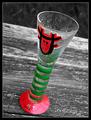
Stained Glass Reverenceby slingshotComment: The idea is nice, but two things bother me a bit: the window looks unsharp, and the bottom is cropped too close, as if you accidentally chopped it off. |
 Photographer found comment helpful. Photographer found comment helpful. |
| 06/22/2004 11:53:05 AM |
Incognito in a world of colourby dhareComment: Fun, technically very good. Slight improvement maybe by putting the fish off-center, to give the impression of a complete ocean he's swimming into. |
| Photographer found comment helpful. |
| 06/22/2004 11:51:06 AM |
Summer Refreshmentby joannsComment: Cute! I think I would have liked this more either completely in color, or with the kids selectively in full-color with only the background desaturated. That's a lot of work, I know, but as it is now the kids look rather bland, which is a pity because the image is great. |
| Photographer found comment helpful. |
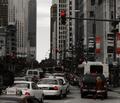
| 06/22/2004 11:48:36 AM |
|
| Photographer found comment helpful. |
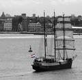
| 06/22/2004 11:46:58 AM |
|
| Photographer found comment helpful. |
| 06/22/2004 11:46:26 AM |
Beachby GolferDDSComment: Although I do like the idea, the composition, and the slight graininess of this, I really think you should have made a more accurate selection of the plant. More work, I know, but it would have made the impact of the one colored plant much better. |
| Photographer found comment helpful. |
| 06/22/2004 11:44:44 AM |
The Dreamby flip89Comment: Oh wow! Possible improvement: selecting and desaturating the spurious spots and banners in the background where some red is left, and selecting the woman to increase saturation on her clothes. As it is now it took me a while to notice her. I very much like the surreal effect of this! |
| Photographer found comment helpful. |
| 06/22/2004 11:41:32 AM |
Urban Decayby VisiBlancoComment: Very impressive! Overexposing the bottom/right-hand part really helps in bringing focus to the bricks. The color combination of the bricks with the B&W is also very effective. 8 |
| Photographer found comment helpful. |
| 06/22/2004 11:17:58 AM |
|
| Photographer found comment helpful. |
| 06/22/2004 11:13:25 AM |
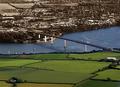
The other sideby AndelainComment: Very original! The only thing I would have liked better is to have the border between color/no color not on the middle of the bridge, but at the point where it touches the other side. More work, I know, but IMO would have been more powerful. 8 |
| Photographer found comment helpful. |
Home -
Challenges -
Community -
League -
Photos -
Cameras -
Lenses -
Learn -
Help -
Terms of Use -
Privacy -
Top ^
DPChallenge, and website content and design, Copyright © 2001-2025 Challenging Technologies, LLC.
All digital photo copyrights belong to the photographers and may not be used without permission.
Current Server Time: 09/03/2025 06:39:25 PM EDT.