| Image |
Comment |
| 05/19/2004 06:34:56 AM |
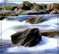
Standing Stillby oskarComment: Nice image, I like the smooth impression of the water. Don't like the border though. Background seems a little bit out of focus, would have been better either sharp or much more blurred. |
 Photographer found comment helpful. Photographer found comment helpful. |
| 05/19/2004 06:26:27 AM |
Riflessi di vetroby makmakComment: It's nice image, but I don't see how this fits the challenge, otherwise I would have given a 7. |
| 05/18/2004 05:50:46 AM |
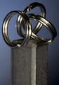
Opposites Attractby gajmajComment: Lighting on this is very nice. Personally, I would have cropped more off the bottom, it seems a bit top-heavy now. |
| Photographer found comment helpful. |
| 05/17/2004 06:27:11 PM |
|
| 05/17/2004 06:24:27 PM |
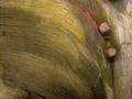
Through and Throughby LENWOODBLUZComment: * Critique Club *
The colors in this image are very powerful! The blueish grey sky makes a nice complement with the orange of the rust. A pity the image as a whole is a bit dark, especially the right and top portions, but it works well nonetheless. The border is too heavy for my taste. The image itself is already quite dark, the border makes it appear even darker. Focus is good, lighting could be more even, although I realize that might be difficult for an outdoor shot. Composition and cropping is perfect, with a good balance in straight and curved lines.
Congrats on an interesting shot! |
| Photographer found comment helpful. |
| 05/17/2004 05:34:59 PM |
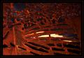
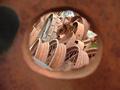
Past Their Prime (Unedited)by trnqltyComment: * Critique Club *
My first impression is that this is an attractive shot, the combination of the rusted hole with the texture of the wheels is really nice. Framing the image with the hole in the middle seems appropriate here, although the dark area to the left is a bit distracting. Tighter cropping probably would work better. The shallow depth of focus works well for me, having the hole out of focus leads the eye into the picture. Colors and lighting are very nice, the small spot of grass adds just the right amount of 'non-rust' color.
Creative take of a nice find for the challenge! |
| Photographer found comment helpful. |
| 05/17/2004 10:14:37 AM |
Moldy Wood and Rusty Nailsby LoneGreyWolf20Comment: * Critique Club *
My first impression is that this shot seems a little flat. This is probably caused by the flat lighting resulting in an absence of shadows, and by the green and brown colors. Increasing saturation of the orange channel would have given more 'pop' to the rust.
On second look, you have an excellent capture of the texture of the wood, which makes this an interesting image to look at. I like the curves in the wood leading to the nails. I would have liked to see a bit more wood to the right of the nails (but that may not have been possible at all, I realise), to give more support on the right part of the frame. Focus is good, the major part of the image is nicely crisp and sharp, with some softness to the left.
In summary: a good and interesting image, that could have improved a bit by color adjustment.
Hope this helps. Feel free to PM me if you have any questions about this comment. |
| 05/16/2004 10:21:32 AM |
learning patience...by rhipsterComment: DOF is very good, although I wonder why parts of the bird seem a little unsharp. There seems to be a quite heavy colored reflection on his belly, would have been nice if you could have corrected that. |
| Photographer found comment helpful. |
| 05/16/2004 10:18:47 AM |
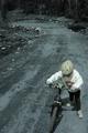
The Long Hard Road Behind Usby LENWOODBLUZComment: Not sure about the colors: it looks partly unsaturated, which leaves the kid in rather bland colors. Composition is good, but I think I would have cropped off a little bit more off the top. |
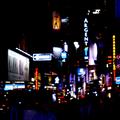
| 05/16/2004 10:16:23 AM |
WTC-Amishby Herblacklist12Comment: Colors are a bit bland, focus seems unsharp. Also, to me the picture doesn't seem to have a topic, other than a rather uninteresting sign. |
| Photographer found comment helpful. |
Home -
Challenges -
Community -
League -
Photos -
Cameras -
Lenses -
Learn -
Help -
Terms of Use -
Privacy -
Top ^
DPChallenge, and website content and design, Copyright © 2001-2025 Challenging Technologies, LLC.
All digital photo copyrights belong to the photographers and may not be used without permission.
Current Server Time: 07/18/2025 02:09:51 PM EDT.