| Image |
Comment |
| 05/12/2009 11:56:20 AM |
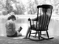
Lazy on a Sunday afternoonby vawendyComment: Very nice idea and execution, ought to ribbon. my only gripe is the rather heavy handed dodging on the back of the boy's head. I like the fact that you burned the chair forward to make it the primary feature, but you went a bit too far in that one spot. On the whole, very well done. |
 Photographer found comment helpful. Photographer found comment helpful. |
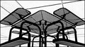
| 05/12/2009 11:52:27 AM |
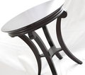
Musical End Tableby kicadiumComment: Quirky framing and angle which supports the style of the table, but the tones seem muted. I wish you had some true blacks to make the table pop free of the backround. |
| Photographer found comment helpful. |
| 05/12/2009 11:50:37 AM |
The Bed with Wheelsby colorcarnivalComment: More bed, and less curtain and wall space would have made a richer image. I like the tangled lead lines, but i want more of those rich tones, reflections and shadows off the bed itself. |
| Photographer found comment helpful. |
| 05/12/2009 11:48:05 AM |
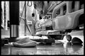
talk about the HOTSEATby cutoutComment: Interesting colors and composition, but I'm not sure what I'm looking at. To say that the piece of furniture in the frame is hard to find is an understatement, I think I see a chair in there, but it is not the first thing that jumps out at me. Good marks on creating an interesting image, not so much on meeting the challenge head on. |
| Photographer found comment helpful. |
| 05/12/2009 11:43:26 AM |
Almost Summerby bob350Comment: Not sure why you flipped this, It seems like a nice bold composition that has a gimmick tossed in at the end to attract attention, but it didn't need it. |
| Photographer found comment helpful. |
| 05/12/2009 11:40:43 AM |
Old Schoolby luvmyaussieComment: About as simple as it gets. nice choice of colors and textures to compliment and contrast, interesting framing and great lighting to bring it all out. My top pick at this point. |
| Photographer found comment helpful. |
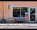
| 05/12/2009 11:38:45 AM |
Barber Benchby BlackboxComment: I'll bet this image breaks down into two voting blocks, those that have been following the topaz or HDR threads will like it, and those that haven't will see it as a snapshot.
Including the area to the left of the barber's pole and squeezing the door to the right makes an unbalanced and uncomfortable image, which may be the effect you wanted (I for one like it) but its not the sort of framing that usually is popular here. |
| Photographer found comment helpful. |
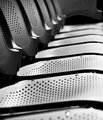
| 05/12/2009 11:34:07 AM |
Spectatingby darynComment: I like the composition, but am not sure why you chose such a narrow depth of field. So much of the image is out of focus and there is nothing special about the parts that have been picked out in the focal plane. I think the lines are really good here, with great eye movement all through the image, and a nice job on the reduction. |
| Photographer found comment helpful. |
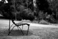
| 05/12/2009 11:29:44 AM |
Park Benchby power47Comment: It looks like the front edge of the bench is slightly out of your focal field. Had it been as sharp as the center of the bench and the grass under it, it would have popped more clearly from the backround. |
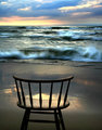
| 05/11/2009 11:44:46 AM |
front row by libertyComment: This is a very lovely shot with a couple of flaws. The colors and mood are perfect, the stillness of the chair contrasting with the blurred action of the waves is great.
What troubles me is the framing which cuts off the legs of the chair, and the sun's reflection on the sand which blurs the line of the seat, as it has the same tones and luminance. Without those flaws it would be my top ribbon pick, with them it is merely very good. |
| Photographer found comment helpful. |
Home -
Challenges -
Community -
League -
Photos -
Cameras -
Lenses -
Learn -
Help -
Terms of Use -
Privacy -
Top ^
DPChallenge, and website content and design, Copyright © 2001-2025 Challenging Technologies, LLC.
All digital photo copyrights belong to the photographers and may not be used without permission.
Current Server Time: 08/14/2025 11:44:58 PM EDT.