|
|
|
Showing 431 - 440 of ~979 |
| Image |
Comment |
| 06/20/2006 01:26:33 PM | Bryan Adamsby coldaComment: goodness, he's looking old... to be honest, i think this is sitting on the borders as to meeting the challenge or not; i mean, it does, the mic stand and the guitar are clearly the elements of the frame, but i don't think the protrait is necessarily enhanced by the presence of these things. he also looks like a small bloke dwarfed by a microphone. nice as a rock pic though. 6. |  Photographer found comment helpful. Photographer found comment helpful. |
| 06/20/2006 01:22:24 PM | Zen framesby xantangummiComment: the lighting and the whiteness of the picture is very soothingly pleasing (yes, very zen-like). it's a shame the chopsticks aren't any more defined - i think your score might suffer as a result. the almost panoramic crop also makes the picture too cramped and confined. 5. | | Photographer found comment helpful. |
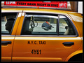
| 06/20/2006 01:19:20 PM | Every Damn Night in June...by visionistComment: very clever! nice titling and use of what's in the frame! i'm taken aback in wonder at your cleverness - inspired! there sn't much to criticise about this. i guess due to the circumstances of the photo - right time, right place - you were probably limited with what you could do, but i think the man at the back would ideally be a bit more of a prominent feature in the shot. but in order to fit it in, not a lot you could do... 7. |
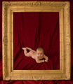
| 06/20/2006 01:12:48 PM | Morganby oOWonderBreadOoComment: appears very professionally done - almost a bit too much if that makes any sense. the frame actually saves it from being another kind of portrait you see in the high street, it's a great ornate beast of a frame, isn't it? goes with the colours of the velvetish material and the sprog very well; the tones are all very complementary. might have cropped three or four millimeters off the bottom, but other than that, wouldn't touch it. great shot for any parent to hang on the wall (frameless canvas, naturally!) 8 | | Photographer found comment helpful. |
| 06/20/2006 01:08:25 PM | Ferdowsiby fereshtehComment: i hope other voters take the time to look at your picture and not dismiss it at a stroke. i nearly did myself - i didn't register the frame for a moment there... but yes, the sky does form a natural frame of sorts, and a quite stunningly beautiful one at that. i think whacking up the contrast, or even taking up the saturation and lowering the lightness on the blues (which you can do under basic) would have made it a bit more obvious, though. your subject seems to be quite an enigmatic character - i was compelled to look him up actually. the statue is beautifully lit, and nicely captured - good for a guide book. nice - 7. |
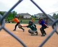
| 06/20/2006 01:00:05 PM | Strike !by whatdewucComment: it's a nice action shot, but i think using the fence as a frame doesn't really work aesthetically. there seems to be some fringing too, which i think might be reduceable with a bit of noise reduction software. it's a pity that the rules don't let you blur the background a bit, as i think it takes away attention from the lads. forgetting the frame element of the picture, it's otherwise quite captivating - it has a story, a certain depth, and is fun. you care if the ball is caught or not (though the title is a giveaway - should have called it "Strike?" :) ). 6. | | Photographer found comment helpful. |
| 06/20/2006 12:54:58 PM | vampiressby irish_eyesComment: do vampires wear jeans? and isn't it a bit dodgy to be out in daylight? minor points for an enjoyably interesting photograph. the angle becomes it's main feature, of course, due to the extremety of it; but i think it works in this case, it feels a natural choice and not at all forced. it's a good applicatoion of the environment, and it fits the challenge really well. might have gone for a slightly squarer crop, possibly from the top of the straw, and also a bit of noise reduction to soften some of the harsher edges. overall though, very likeable. 7. |
| 06/20/2006 12:47:50 PM | Self portraitby nagymelisComment: this is a very stylish and swanky portrait. its simplicity is its strongest point; the composition is nice, tidy, and has immediate impact. a dumb thing to complain about, but the tripod looks a bit too modern and the lever arm thingy is a bit too prominent... everything else is very nice. i like the tones, and i love the frame and how it's strung up - i think something would have been lost if you could and did clone out the strings. did you actually use the camera to take a picture of the camera taking a picture of you? 8. |
| 06/19/2006 06:02:35 PM | Partido del Piñata!!by ShermyComment: can't believe this only finished 20th. not a bad score per se, but this deserved so much more! hilarious, fun, dramatic, technically flawless, imaginative, unabashedly violent towards innocent pinatas, the works. and one of the best presentations of a shadow in the challenge. | | Photographer found comment helpful. |
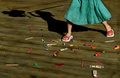
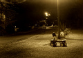
| 06/19/2006 05:50:11 PM | Daddy Didn't Visit....Againby neenee1999Comment: okay, i'll get the title out o the way first, because frankly, it's a bit rubbish, and it does you photograph no good whatsoever. it feels too heavy handed and completely unnecessary. the shot says so much on it's own, and is so rich in character and feeling and emotion and mood that your title dilutes it. so i'm going to wipe your title from my mind and bask in the brilliance that is your artwork. it's brilliantly understated ,and lit so well fully embracing the environment in which it was taken. technically, it could do with being a little sharper (tripod on a timer?) and the only thin i would have done differently is cropped about half an inch to lose some of the glare at the top. the sepia is a perfect choice, it conveys a sad warmth... i like that your a good distance from the subject too; there is great composition here. very well done. 9. | | Photographer found comment helpful. |
|
Showing 431 - 440 of ~979 |
Home -
Challenges -
Community -
League -
Photos -
Cameras -
Lenses -
Learn -
Help -
Terms of Use -
Privacy -
Top ^
DPChallenge, and website content and design, Copyright © 2001-2025 Challenging Technologies, LLC.
All digital photo copyrights belong to the photographers and may not be used without permission.
Current Server Time: 08/17/2025 02:25:40 AM EDT.
|