| Image |
Comment |
| 06/23/2006 03:58:31 AM |
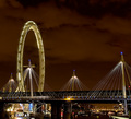
The London Eye by KHoltComment: it's a shame hungerford bridge (or whatever it's called now) was in the way, as it doesn't really compliment the overall shot, and the stuff under the bridge is kind of messy and distracting... i think location is an important factor here. or alternatively, given that the eye and the sky are the most wonderful bits, cropping in such a way that only the top half of the wheel is in the shot making it more of an abstract piece - could even rotate it 90° to make it look a bit more abstracty. just a bit too cluttered for my liking, sorry. 6. |
 Photographer found comment helpful. Photographer found comment helpful. |
| 06/23/2006 03:54:00 AM |
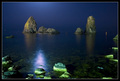
Moonlight...by gipomontesantoComment: i note it's your title, and therefore should be the principal subject, but i think your overall composition has suffered a bit from the reflection of the moon... i would really have been tempted to crop out the reflection and (flash lit?) rocks in the bottom third and have more emphasis on the rocks and the lovely lush blues in the background, both of which you have captured very well in a fairytaleesque kind of way. my favourite aspect is that there is no horizon - it's so nice... 6. |
| Photographer found comment helpful. |
| 06/22/2006 02:31:24 PM |
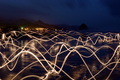
Luminosityby ZoomdakComment: this is a bit barmy, and i can only imagine some poor bugger being made to run and jump about with a torch. i hope you bought them fish and chips after. it's a wonderful picture, though the town in the background is a bit unfortunate. i love how the light is reflected on the beach and the blue / rocky outcrop thing at the back is gorgeous. it's a wonderful composition - 10. |
| Photographer found comment helpful. |
| 06/22/2006 02:29:03 PM |
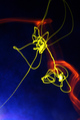
Untitledby fstopstigmataComment: this is a very attractive abstract image ;the bright bold colours are very effective, and it gives the appearance of a painting as opposed to a photograph - or even an image generated from a computer it has that much of an unearthly unnatural feel about it. i like this very much, and is an exquisite use of a super-long exposure. well done - 9. |
| Photographer found comment helpful. |
| 06/20/2006 02:03:35 PM |
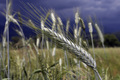
grainby blacjackComment: this is gorgeous - very lovely colours, depth of field (ha! field!!), the level of detail, that sky... it's beautiful, and only let down by the fact that it's frameless. i might be being a doofus, but i honestly don't see it, and given it's the essense of the challenge, i should unfortunately drop my vote a little bit. still bloody lovely though. 7. |
| Photographer found comment helpful. |
| 06/20/2006 02:00:53 PM |
Viewfinder (no advanced editing)by SciPugComment: you could have just got the picture validated in lieu of your title, you know. it's definitely very clever, though it's oddly small... and it's also a bit difficult to see exactly what the picture is of. but i like it as an abstract piece, and the mix of dark and light has a great impact. it's certainly intriguing. 8. |
| 06/20/2006 01:57:26 PM |
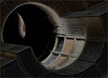
Eclipseby gullyComment: wow, this is so sci-fi! i love this so much; it's dramatic, intriguing, very different. i have no idea what it was, but it feels like a space station made from stone (and unless you work for some secret meglomaniac, i trust it isn't). i love the slightly muted colours, the level of noise, the odd, not quite natural angle. so far my favourite of the challenge. 10 |
| Photographer found comment helpful. |
| 06/20/2006 01:54:36 PM |
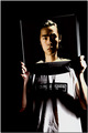
take this shotby TJComment: this is so simple it's a wonder no one else did it. it's brillant; complies with the challenge, expertly taken and it works. it's playful, fun, and is a good portrait. i like how the lighting on the hands is lighter than the face, as it adds a sense of distance and depth... i think i might like the hands to be a little blurrier and the facial features a smidgeon sharper, but that aside a good solid spiffing picture. 8. |
| Photographer found comment helpful. |
| 06/20/2006 01:43:10 PM |
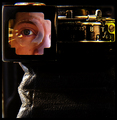
Inside - Outsideby eggfoxComment: this is actually bordering on bonkers. took me a few moments to see that the head doesn't seem to belong to the body holding it up. and also, the green light on the monitor is a bit unnerving. i can't quite figure out what the concet actually is, to be honest. i guess this makes it art! i like it though, it has a very modernist feel, and some depth in a philisophical sense - well beyond my brain, obvoiusly, but i can see something deep is going on. only comment about the technical bits are that for me the contrast is a bit too contrasty, but i like the unconventional crop (though might have been tempted to lose the stuff below the elbows) and wonkiness. it's a striking composition - 7. |
| Photographer found comment helpful. |
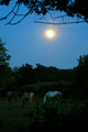
| 06/20/2006 01:34:15 PM |
Moonlight Snackby TygerrComment: hee - i initially thought the horses were the snack! (for obvius reasons) the lighting is too dark really. you could fix this a bit using levels (i assume you have photoshop elements) - try 0-1.60-223 on the RGB channel and 0-0.69-219 on the blue channel; i think it might improve the colours a bit without blowing out the moon too much. it also makes the difference between the bush and the grass more obvious, therefore making the framing element more obvious (i initially thought the moon was the thing being framed with other stuff going on). 5. |
| Photographer found comment helpful. |
Home -
Challenges -
Community -
League -
Photos -
Cameras -
Lenses -
Learn -
Help -
Terms of Use -
Privacy -
Top ^
DPChallenge, and website content and design, Copyright © 2001-2025 Challenging Technologies, LLC.
All digital photo copyrights belong to the photographers and may not be used without permission.
Current Server Time: 08/17/2025 12:47:20 AM EDT.