| Author | Thread |
Comments Made During the Challenge  |
|
|
06/20/2006 11:11:38 PM |
|
Pretty neat. Wish it was a little bigger or something so I could see what was gong on better. |
|
|
|
06/20/2006 10:54:54 PM |
|
|
|
06/20/2006 10:30:56 PM |
|
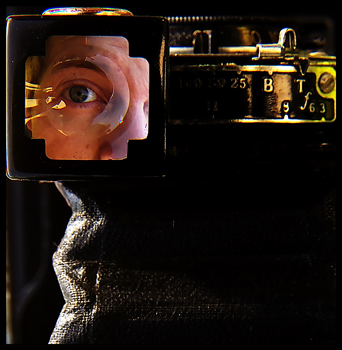
wonderful gold details to go with the facial details, supported by a nice simple black shape. an overall evocation of a mix of man and machine. 8 |
|
|
|
06/20/2006 10:03:47 PM |
|
7 - Good and unusual. Bigger (640 height in this case), slight variation in angle - to eliminate that 'line' on the left which detracts, but fairly minor and possibly a little more detail in the 'hood', make this even better in my opinion. |
|
|
|
06/20/2006 02:00:53 PM |
|
you could have just got the picture validated in lieu of your title, you know. it's definitely very clever, though it's oddly small... and it's also a bit difficult to see exactly what the picture is of. but i like it as an abstract piece, and the mix of dark and light has a great impact. it's certainly intriguing. 8. |
|
|
|
06/20/2006 06:49:22 AM |
|
Ohh, It's too small. I think it's a great picture. You would had gotten a lot more if it were bigger. |
|
|
|
06/19/2006 08:49:47 PM |
Very creative, I'd love for this to be bigger, 640x640!
Nice photo! |
|
|
|
06/19/2006 12:46:32 PM |
|
very nice (and nice preemptive defense lol) |
|
|
|
06/18/2006 07:26:47 AM |
|
Really like this but I think the dark area to the bottom right destracts a bit. |
|
|
|
06/17/2006 11:43:54 AM |
|
I really like the square corp on this. It seems a little small. |
|
|
|
06/15/2006 02:51:21 PM |
|
nice shot creatively but the size of the file hurts it a bit.. a little more light under the gold would give it more dimension as well.. |
|
|
|
06/15/2006 01:00:35 AM |
|
It doesn't look like advanced editing to me. but it is a cool photo! |
|
|
|
06/14/2006 10:34:07 PM |
|
take a look at this tutorialI think this would have had a chance to do really well if you had made it the max alllowable size of 640 pixels, yours is 350. Excellent shot though and will have to go back and look at how you did it. |
|
|
|
06/14/2006 09:34:55 PM |
|
I think that this would be ribbon material if it were larger. Why not take advantage of the size allowances? |
|
|
|
06/14/2006 09:18:27 PM |
|
An interesting mental exercise to figure out what it is you're looking through. I wasn't able to do it. Interesting picture, nice take on the challenge. |
|
|
|
06/14/2006 09:03:54 PM |
|
very creative...I likey it |
|
|
|
06/14/2006 08:43:13 PM |
|
clever shot. would like to see more detail in the dark. |
|
|
|
06/14/2006 10:00:54 AM |
|
|
|
06/14/2006 09:26:43 AM |
|
COOL. Love the off centering in the upper left corner. Wish the image were bigger. |
|
|
|
06/14/2006 07:18:35 AM |
|
Clever, and the lighting at the top right is beautiful. |
|
|
|
06/14/2006 06:19:05 AM |
|
why didn't you save this at 640x640px? It's just too hard to judge at this size...I reckon if you did this might have ribboned...this is half the size it could have been |
|
Home -
Challenges -
Community -
League -
Photos -
Cameras -
Lenses -
Learn -
Help -
Terms of Use -
Privacy -
Top ^
DPChallenge, and website content and design, Copyright © 2001-2026 Challenging Technologies, LLC.
All digital photo copyrights belong to the photographers and may not be used without permission.
Current Server Time: 06/28/2026 06:31:22 PM EDT.