| Image |
Comment |
| 07/24/2006 02:44:54 PM |
The Raven Kingby LevTComment: lovely shot. clarity is superb, lighting and colours are very nice. the birds certainy add a certain depth and dimension, and do add something to the feel. the only slight picky bit is the reflections . lighting looks a tad off on his right (our left) wing. something feels a bit odd round his foot, like a bit of editting has happened - probably hasn't, but it looks like it has... still, a really cool capture of some city art. 8
. |
 Photographer found comment helpful. Photographer found comment helpful. |
| 07/24/2006 02:40:36 PM |
Roughby Arti-ElviComment: a superb picture, albeit a bit scary. the high definition of the eyes are what make it for me, as are other very fantastic details including the precise depth of field, wonderfully complimentary shades of gold, the texture of the hair... great, unnerving, disturbing, mix of being inspiring and bloody annoying because i know i could never be so creative. 10. |
| Photographer found comment helpful. |
| 07/24/2006 02:40:11 AM |
Golden Poppyby cbonsallComment: this is a lovely image, but the focus on the bee is just (noticably) a smidgeon too soft. this is easily rectifiable with a mix of unsharp mask and sharpen edges. given that he's the main point of interest, i thik it would be worth doing. other than that it's really nice - the colours are rich and i feel suitably golden (albeit the flower is a touch orange) and the depth of field / bokeh has a really nice effect overall. 7. |
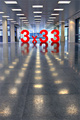
| 07/17/2006 02:56:56 AM |
Accurate to One Decimal Placeby Mr_PantsComment: i honestly considered this to be rather fantastic, and promptly awarded your picture a 9. i'm somewhat dismayed it ended up 72nd, because it was one of my three favourites. the in-your-faceness of the numbers, their colour and size, are visually stunning. my only real criticism is the way it's been cropped; i feel that if you lost the bottom third or half, and made the shot squarer / more landscaped then i think it would feel more balanced; there just seems to be too much floor. but beyond that, i thought it was great, creative and huge fun.
being super pinickity thoguh, the title would have been better if you said it was to zero decimal places...
|
| Photographer found comment helpful. |
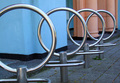
| 07/14/2006 03:47:53 AM |
Parallel Tens on Edgeby lwiley212Comment: i've looked at this now a few times, and sadly its 10iness isn't strongly apparent enough... if you rotated the picture 90 degrees, and had less overlap between the things (cycle stands?) i think it would be more successful. the background is a bit overpowering too - maybe a play with the burn tool or somesuch to darken it might help? otherwise, it's good, it's a creative application of street furniture, but for me doesn't have that little sparkle. 6. |
| Photographer found comment helpful. |
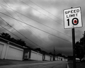
| 07/14/2006 03:44:18 AM |
Bright Spot in a Dreary Dayby RebeccaComment: i don't feel that the flower actually adds anything here; you would still have had a brilliant, atmospheric and stylish image without it. in fact, the flower just pushes it over the fineline of cheese... the angle of the shot, the choice of the environment (all those repetitive garage doors are visually very pleasing), the day you did it (lovely dramatic clouds) and the post processing are all what makes this top notch. 9. |
| Photographer found comment helpful. |
| 07/14/2006 03:36:46 AM |
Break 10 of Tenby karmatComment: regrettably, it looks like a badly squished photo rather than what i guess are a bunch of a bit too realistically painted eggs. i am slightly worried that a lot of voters are not going to see the added depth of the subject matter here, because you did such a good job decorating them... i like it though - 7. |
| Photographer found comment helpful. |
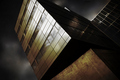
| 07/07/2006 02:41:40 AM |
Full of energyby Ragga2000Comment: this is an incredibly gorgeous image. you've managed to capture, enhance and maximise the dynamicness of the building so well; it's almost like the best sort of portraits in that you've really nailed the buildings character. i love how someone described it as "wilfully malevolent" - a bang on description that. i mean, the angle, the colours, the light, everything works really well. i love the depth of focus too, how it gets a little soft the further back you look. i hope you realise how inspiring this image is. look at the reflections in the glass - fantastic! this so deserved better than 22nd. technically sound (i personally like the crop - makes it look more widescreen to suit it's sci-fi dystopian feel), and a great choice of subject... |
| Photographer found comment helpful. |
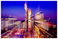
| 06/27/2006 04:55:08 AM |
Shooting the Breezeby ArtanComment: lovely shot! the zoom blur effect is very, er, effective here; and not done excessively so either. the mix of bright colours is very pleasing, though one wonders how it would look with the contrast and brightness cranked up a little bit to make it feel a bit more neon like... still, excellently dramatic cityscape. 9. |
| Photographer found comment helpful. |
| 06/27/2006 04:44:14 AM |
Death Of A Cucumber, Birth Of A Saladby JSAYBComment: well, you do get the prize for most dramatic title this week! you have complied with the challenge, so no problems there. It oculd do with some improvement in the white balance department; it has this light brown sheen over it which gives a false impression of colours - something which can easily be fixed post processing. a lot of the bottom half of the picture is a bit unnecessary; having the principal subject in the top half rarely looks right i found, and by cropping say 5-10mm below the bottom edge of the cucumber might give a more balanced composition. 4. |
| Photographer found comment helpful. |
Home -
Challenges -
Community -
League -
Photos -
Cameras -
Lenses -
Learn -
Help -
Terms of Use -
Privacy -
Top ^
DPChallenge, and website content and design, Copyright © 2001-2025 Challenging Technologies, LLC.
All digital photo copyrights belong to the photographers and may not be used without permission.
Current Server Time: 08/16/2025 03:51:11 PM EDT.